3 Gramática dos gráficos
3.1 ggplot2

Embora o R possua diversas funções nativas para a visualização de dados, o pacote ggplot2 se consolidou como a principal referência, graças à sua organização baseada na Grammar of Graphics.

Essa estrutura em camadas possibilita separar dados, mapeamentos estéticos, geometrias e escalas, facilitando a criação de gráficos mais claros, consistentes e personalizáveis.
Mapeamento estético: aes()
Posição: x e y;
Cor: color;
Preenchimento: fill;
Transparência: alpha;
Tamanho: size;
Formato: shape;
Geometrias: geom();
 [1] "geom_abline"            "geom_area"              "geom_bar"
 [4] "geom_bin_2d"            "geom_bin2d"             "geom_blank"
 [7] "geom_boxplot"           "geom_col"               "geom_contour"
[10] "geom_contour_filled"    "geom_count"             "geom_crossbar"
[13] "geom_curve"             "geom_density"           "geom_density_2d"
[16] "geom_density_2d_filled" "geom_density2d"         "geom_density2d_filled"
[19] "geom_dotplot"           "geom_errorbar"          "geom_errorbarh"
[22] "geom_freqpoly"          "geom_function"          "geom_hex"
[25] "geom_histogram"         "geom_hline"             "geom_jitter"
[28] "geom_label"             "geom_line"              "geom_linerange"
[31] "geom_map"               "geom_path"              "geom_point"
[34] "geom_pointrange"        "geom_polygon"           "geom_qq"
[37] "geom_qq_line"           "geom_quantile"          "geom_raster"
[40] "geom_rect"              "geom_ribbon"            "geom_rug"
[43] "geom_segment"           "geom_sf"                "geom_sf_label"
[46] "geom_sf_text"           "geom_smooth"            "geom_spoke"
[49] "geom_step"              "geom_text"              "geom_tile"
[52] "geom_violin"            "geom_vline"
Facetas: permitem a criação de múltiplos gráficos divididos por uma ou mais variáveis (facet_wrap e facet_grid);
Estatísticas: permitem realizar cálculos e resumos dos dados diretamente no gráfico;
 [1] "stat_align"             "stat_bin"               "stat_bin_2d"
 [4] "stat_bin_hex"           "stat_bin2d"             "stat_binhex"
 [7] "stat_boxplot"           "stat_contour"           "stat_contour_filled"
[10] "stat_count"             "stat_density"           "stat_density_2d"
[13] "stat_density_2d_filled" "stat_density2d"         "stat_density2d_filled"
[16] "stat_ecdf"              "stat_ellipse"           "stat_function"
[19] "stat_identity"          "stat_qq"                "stat_qq_line"
[22] "stat_quantile"          "stat_sf"                "stat_sf_coordinates"
[25] "stat_smooth"            "stat_spoke"             "stat_sum"
[28] "stat_summary"           "stat_summary_2d"        "stat_summary_bin"
[31] "stat_summary_hex"       "stat_summary2d"         "stat_unique"
[34] "stat_ydensity"
Coordenadas: controlam o sistema de coordenadas do gráfico, permitindo ajustar a visualização dos dados e modificar a forma como eles são apresentados (coord_flip, coord_polar e coord_cartesian);
Escalas: permitem ajustar a forma como os dados são mapeados para as estéticas do gráfico, como cores, tamanhos e formas (scale_shape_manual, scale_fill_brewer, scale_x_continuous, scale_y_discrete);
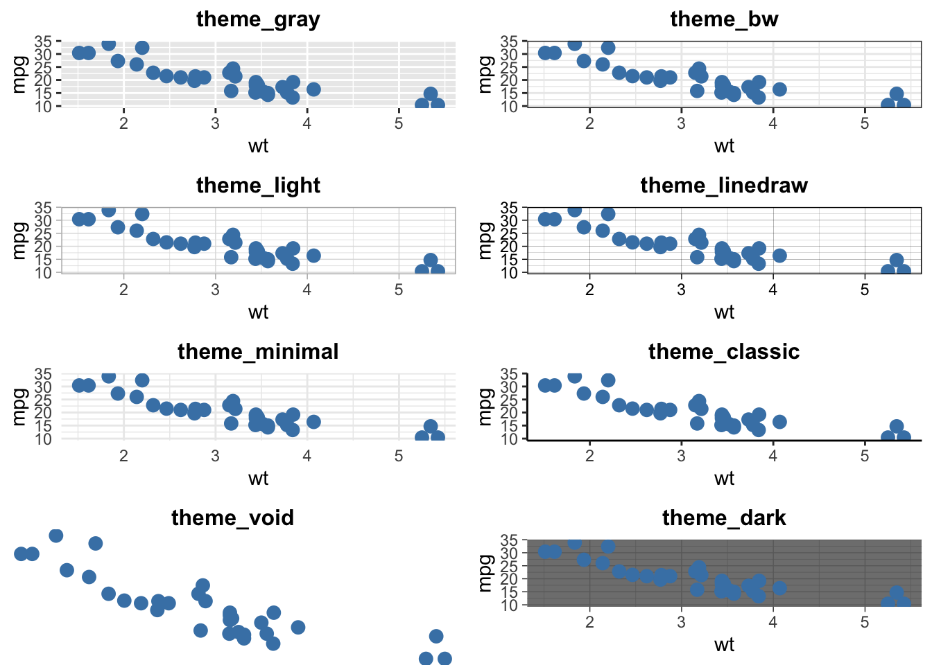
Temas: permitem personalizar a aparência visual dos gráficos, ajustando elementos estéticos como o fundo, as linhas de grade e os rótulos.
Temas pré-definidos:
labs(): é usada para modificar os rótulos de títulos e subtítulos (title e subtitle), eixos (x e y) e legendas (fill, color, shape, size e alpha).
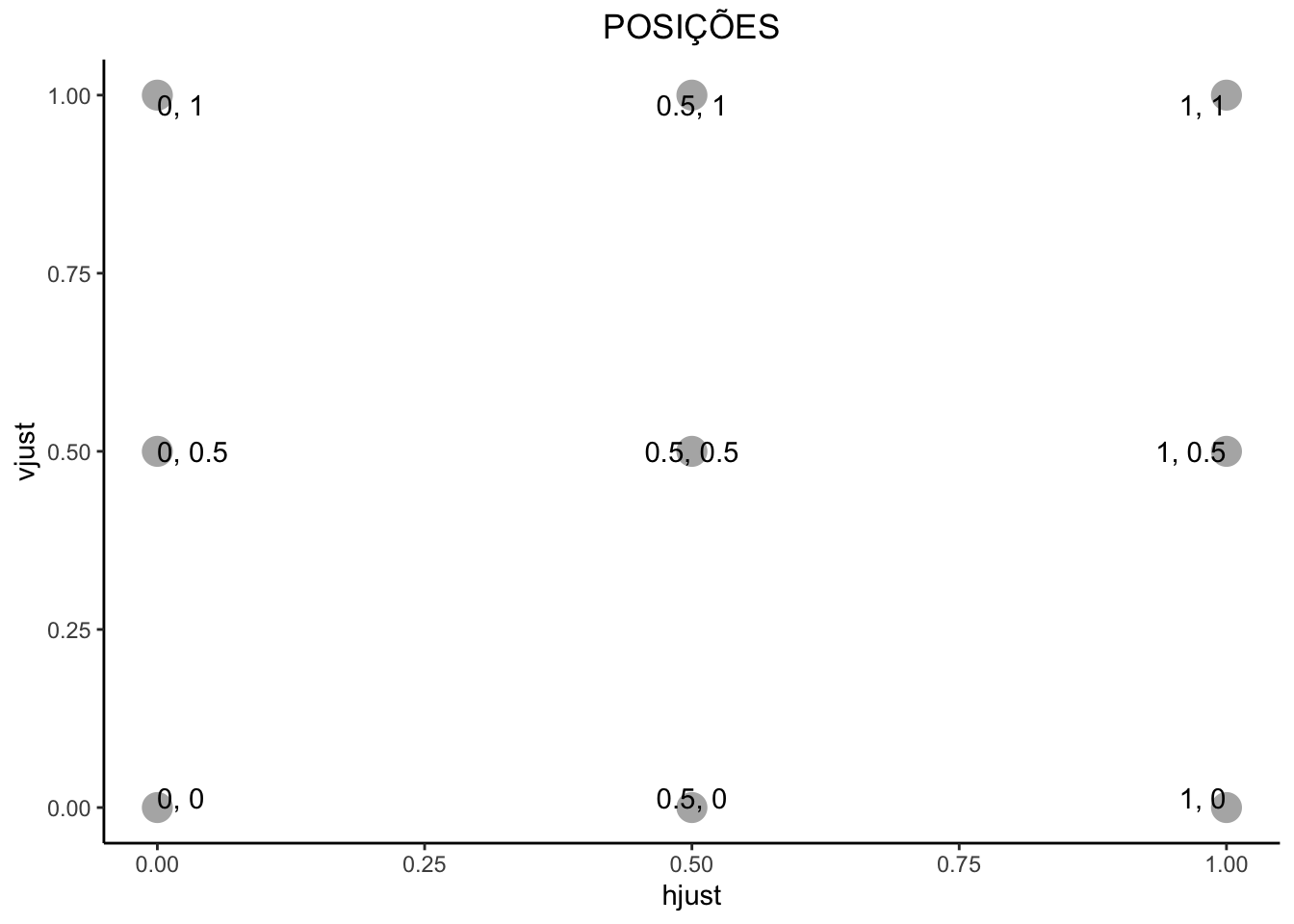
Justificação (h, v)
Horizontal: left = 0, center = 0.5, right = 1
Vertical: top = 1, middle = 0.5, bottom = 0
Primeiro gráfico
library(ggplot2)

ggplot()
summary(mtcars) mpg cyl disp hp
Min. :10.40 Min. :4.000 Min. : 71.1 Min. : 52.0
1st Qu.:15.43 1st Qu.:4.000 1st Qu.:120.8 1st Qu.: 96.5
Median :19.20 Median :6.000 Median :196.3 Median :123.0
Mean :20.09 Mean :6.188 Mean :230.7 Mean :146.7
3rd Qu.:22.80 3rd Qu.:8.000 3rd Qu.:326.0 3rd Qu.:180.0
Max. :33.90 Max. :8.000 Max. :472.0 Max. :335.0
drat wt qsec vs
Min. :2.760 Min. :1.513 Min. :14.50 Min. :0.0000
1st Qu.:3.080 1st Qu.:2.581 1st Qu.:16.89 1st Qu.:0.0000
Median :3.695 Median :3.325 Median :17.71 Median :0.0000
Mean :3.597 Mean :3.217 Mean :17.85 Mean :0.4375
3rd Qu.:3.920 3rd Qu.:3.610 3rd Qu.:18.90 3rd Qu.:1.0000
Max. :4.930 Max. :5.424 Max. :22.90 Max. :1.0000
am gear carb
Min. :0.0000 Min. :3.000 Min. :1.000
1st Qu.:0.0000 1st Qu.:3.000 1st Qu.:2.000
Median :0.0000 Median :4.000 Median :2.000
Mean :0.4062 Mean :3.688 Mean :2.812
3rd Qu.:1.0000 3rd Qu.:4.000 3rd Qu.:4.000
Max. :1.0000 Max. :5.000 Max. :8.000 ggplot(mtcars, aes(x = mpg))
ggplot(mtcars, aes(x = mpg)) +
  geom_histogram()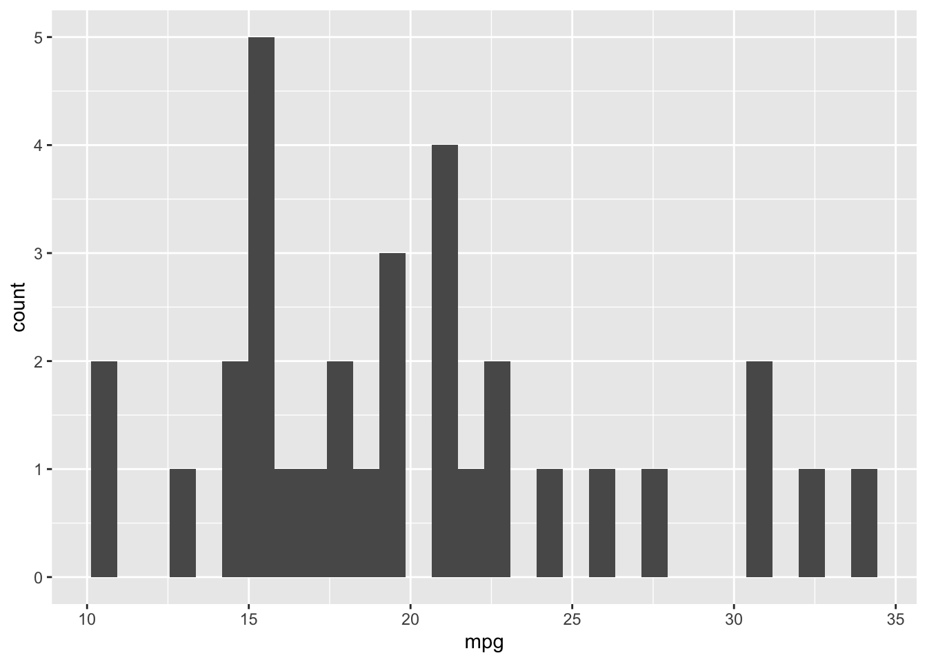
ggplot(mtcars, aes(x = mpg)) +
  geom_histogram(bins = 10, color = "black", fill = "lightblue") +
  labs(x = "Milhas por galão", y = "Quantidade", title = "Distribuição de milhas por Galão") +
  theme_classic() +
  theme(plot.title = element_text(hjust = 0.5))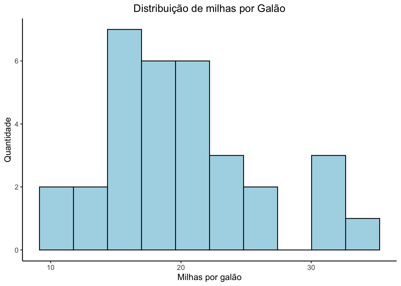
Facetas
ggplot(mtcars, aes(x = wt, y = mpg)) +
  geom_point() +
  facet_wrap(~ cyl) +
  labs(title = "Número de cilindros", x = "Peso", y = "Milhas por galão") +
  theme_minimal() +
  theme(plot.title = element_text(hjust = 0.5))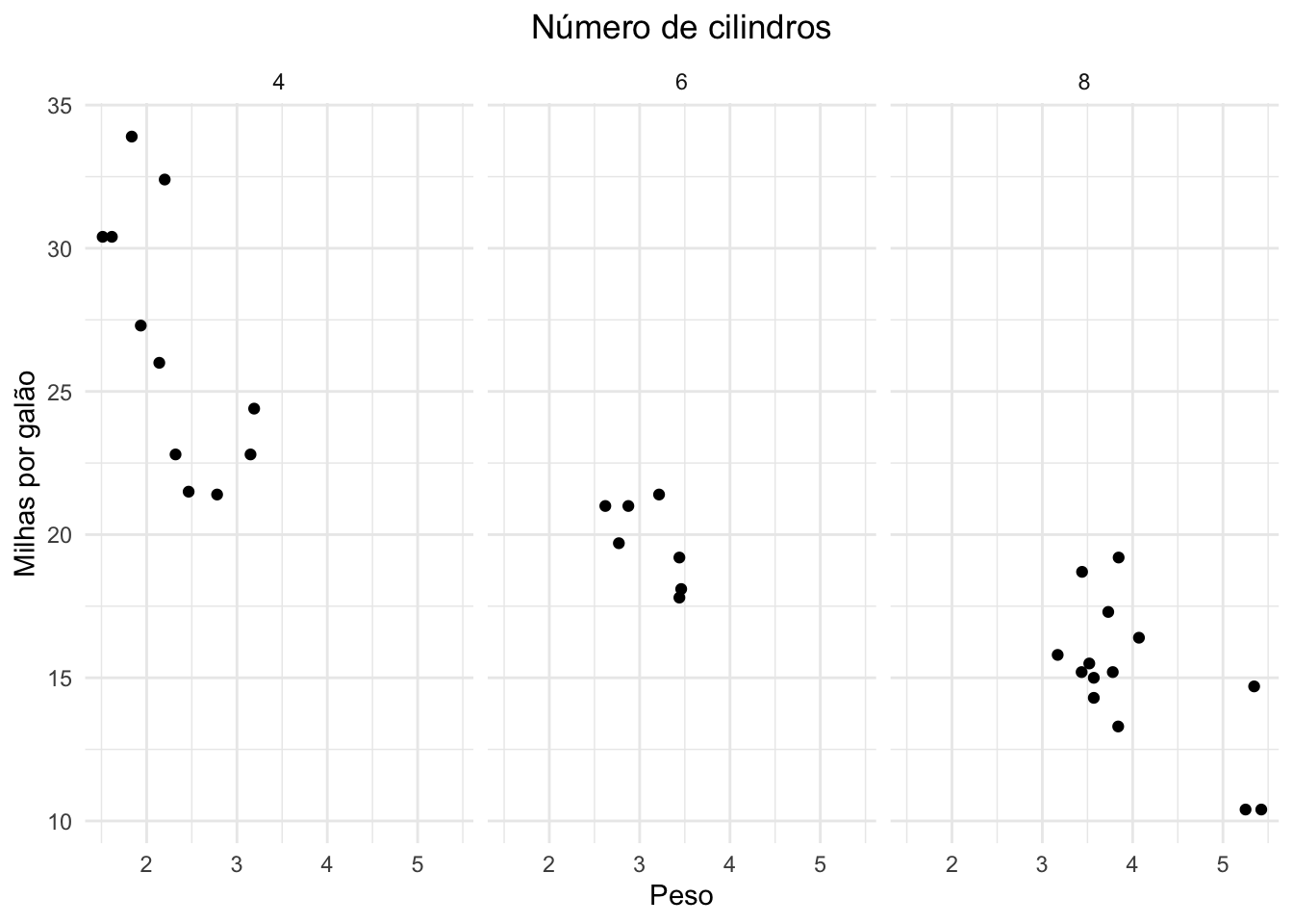
Estética dinâmica
ggplot(mtcars, aes(x = wt, y = mpg, color = as.factor(cyl), size = hp)) +
  geom_point() +
  labs(title = "Peso x Consumo por cilindros e potência", color = "cyl") +
  theme_minimal() +
  theme(plot.title = element_text(hjust = 0.5))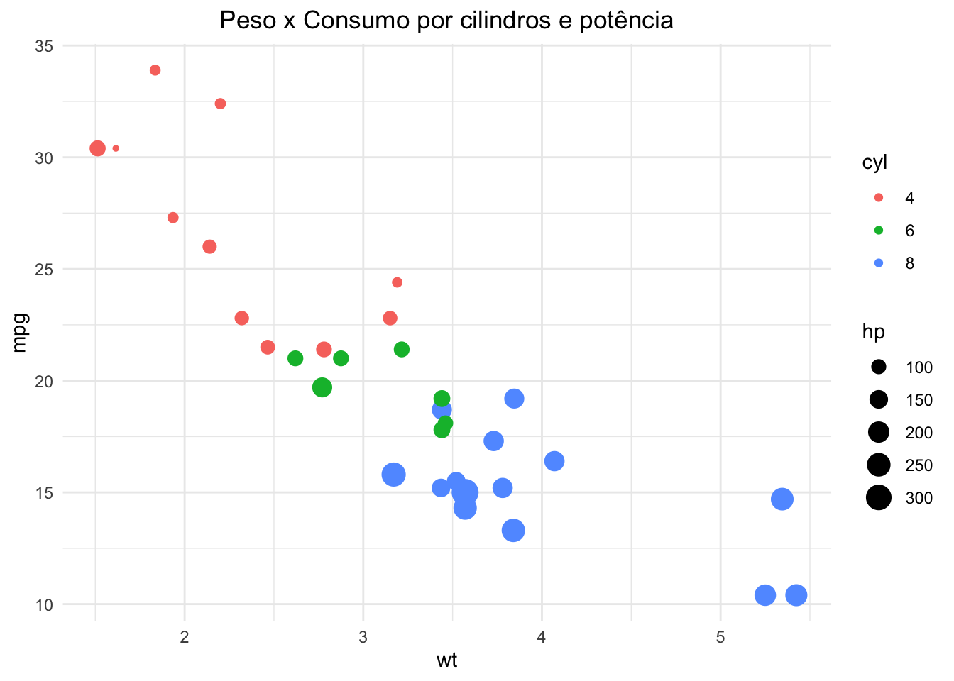
Sobreposição
ggplot(mtcars, aes(x = wt, y = mpg)) +
  geom_point(color = "blue", size = 3) +
  geom_line(color = "red", linewidth = 1) +
  labs(title = " ", x = "Peso", y = "Milhas por galão") +
  theme_minimal()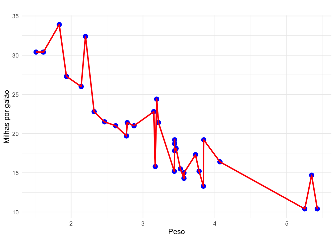
ggplot(mtcars, aes(x = wt, y = mpg)) +
  geom_line(color = "red", linewidth = 1) +
  geom_point(color = "blue", size = 3) +
  labs(title = " ", x = "Peso", y = "Milhas por galão") +
theme_minimal() 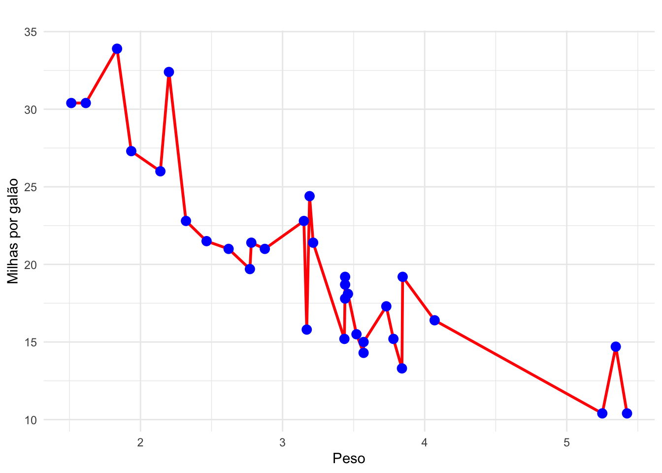
Exportação de gráficos
#Salvando o último gráfico plotado
ggsave(filename = "grafico.png",
       height = 5,                 #altura
       width = 9,                  #largura
dpi = 500) #qualidadelibrary(tidyverse)Anotações
Em um mundo inundado por dados, a capacidade de criar visualizações que facilitam a interpretação rápida e clara é mais crucial do que nunca.
geom_text: Serve para adicionar textos diretamente nos gráficos.
Estrutura: geom_text(aes(label = …))
geom_label: Serve para adicionar textos dentro de caixas retangulares diretamente nos gráficos.
Estrutura: geom_label(aes(label = …))
df1 <- mtcars %>%
  group_by(cyl) %>%
  summarise(media_mpg = mean(mpg))

(ggplot(df1, aes(x = factor(cyl), y = media_mpg)) +
  geom_col(fill = "skyblue") +
  geom_text(aes(label = round(media_mpg, 1)), vjust = -0.5, size = 5) +
  ylim(0, 32))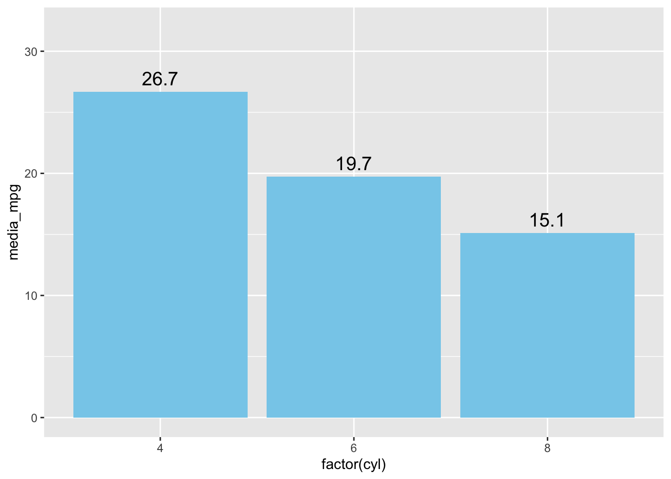
(ggplot(df1, aes(x = factor(cyl), y = media_mpg)) +
  geom_col(fill = "skyblue") +
  geom_label(aes(label = round(media_mpg, 1)), vjust = -0.5, size = 5) +
  ylim(0, 35))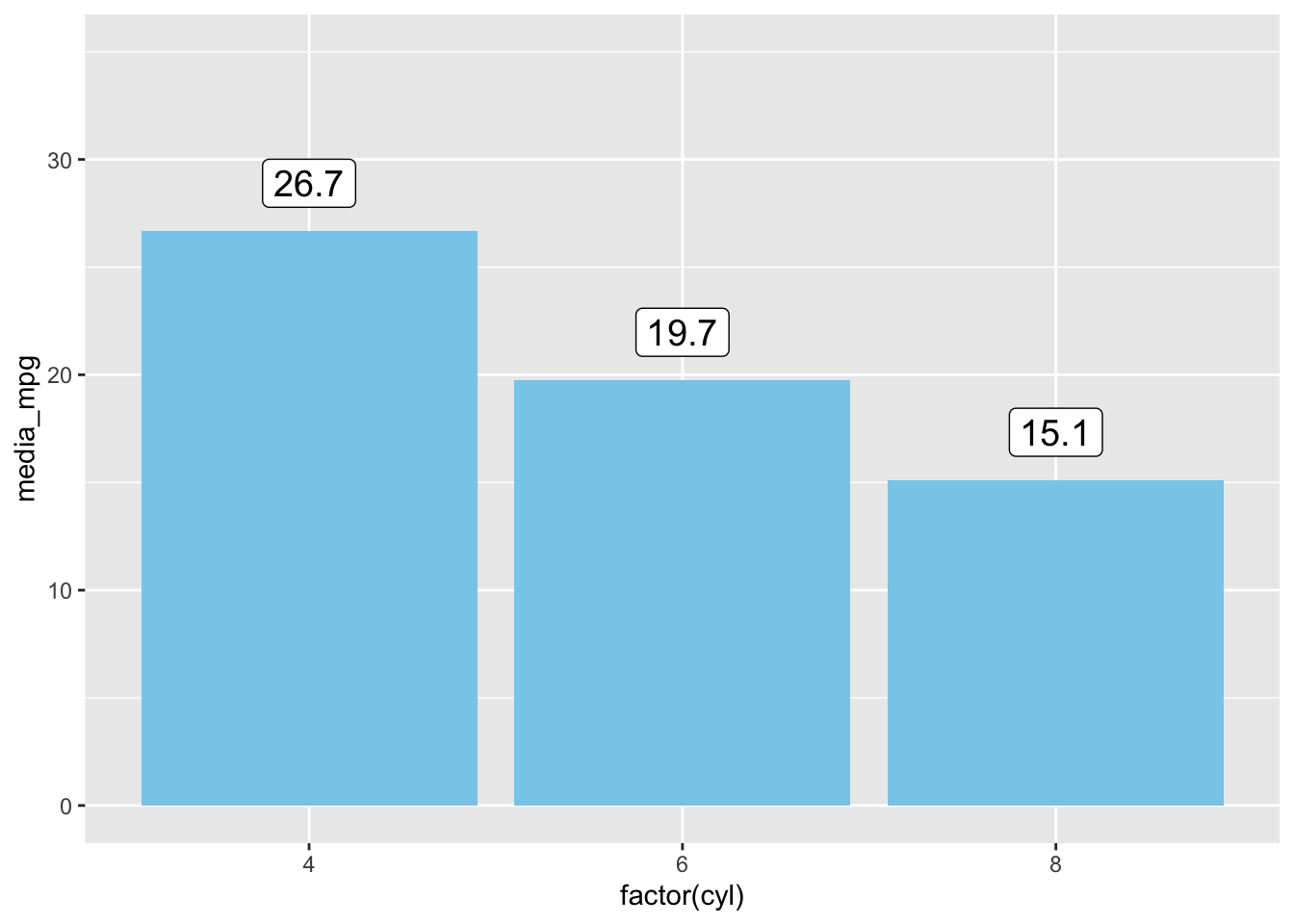
df2 <- mtcars %>%
  count(gear) %>%
  mutate(perc = round(n / sum(n) * 100, 1))

(ggplot(df2, aes(x = factor(gear), y = n, fill = factor(gear))) +
  geom_col() +
  geom_text(aes(label = paste0(perc, "%")), vjust = -0.5) +
  ylim(0, 18))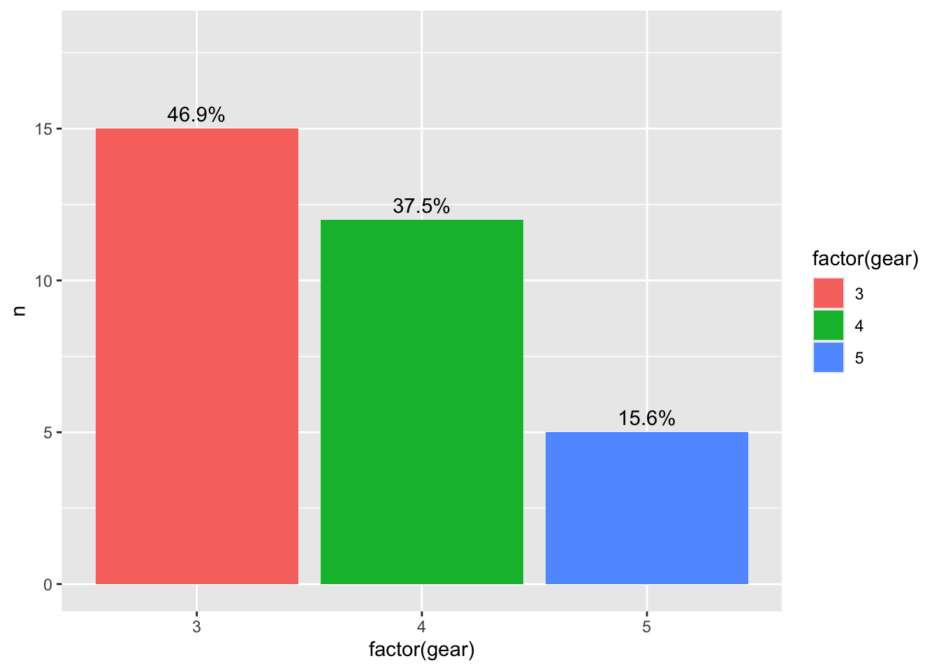
(ggplot(df2, aes(x = factor(gear), y = n, fill = factor(gear))) +
  geom_col() +
  geom_label(aes(label = paste0(perc, "%")), vjust = -0.5) +
  ylim(0, 18))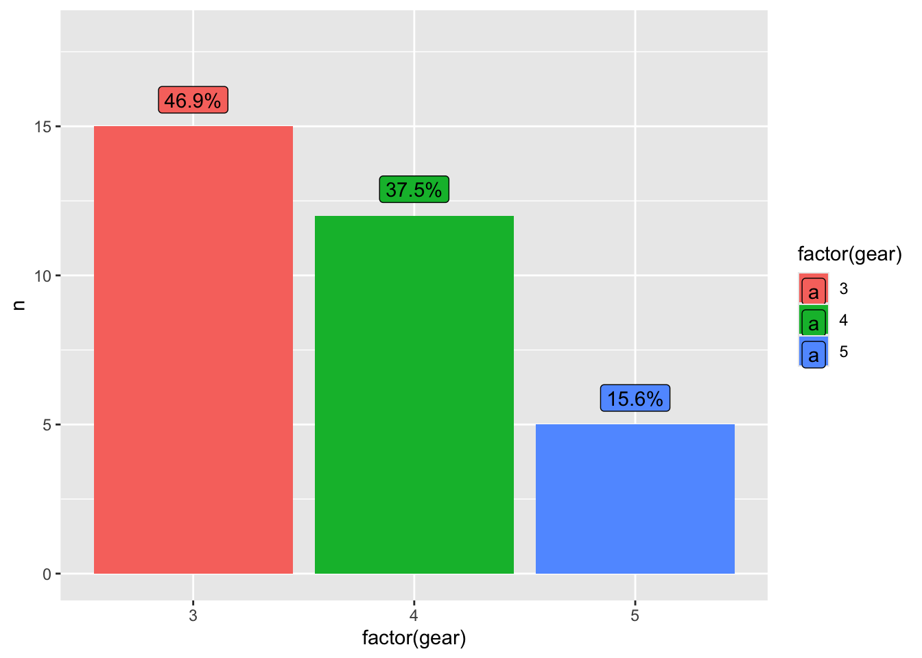
df3 <- mtcars %>%
  group_by(cyl) %>%
  summarise(media_hp = mean(hp))

ggplot(df3, aes(x = factor(cyl), y = media_hp)) +
  geom_col(fill = "orange") +
  geom_text(aes(label = round(media_hp, 1)),
            vjust = 1.5, color = "white", size = 5)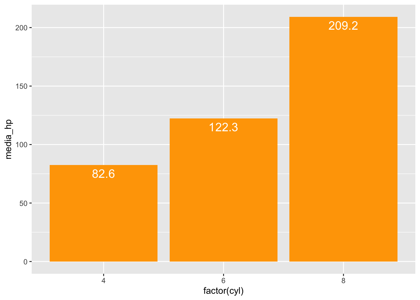
ggplot(df3, aes(x = factor(cyl), y = media_hp)) +
  geom_col(fill = "orange") +
  geom_label(aes(label = round(media_hp, 1)),
             vjust = 1.5, color = "white", fill = "black", size = 5)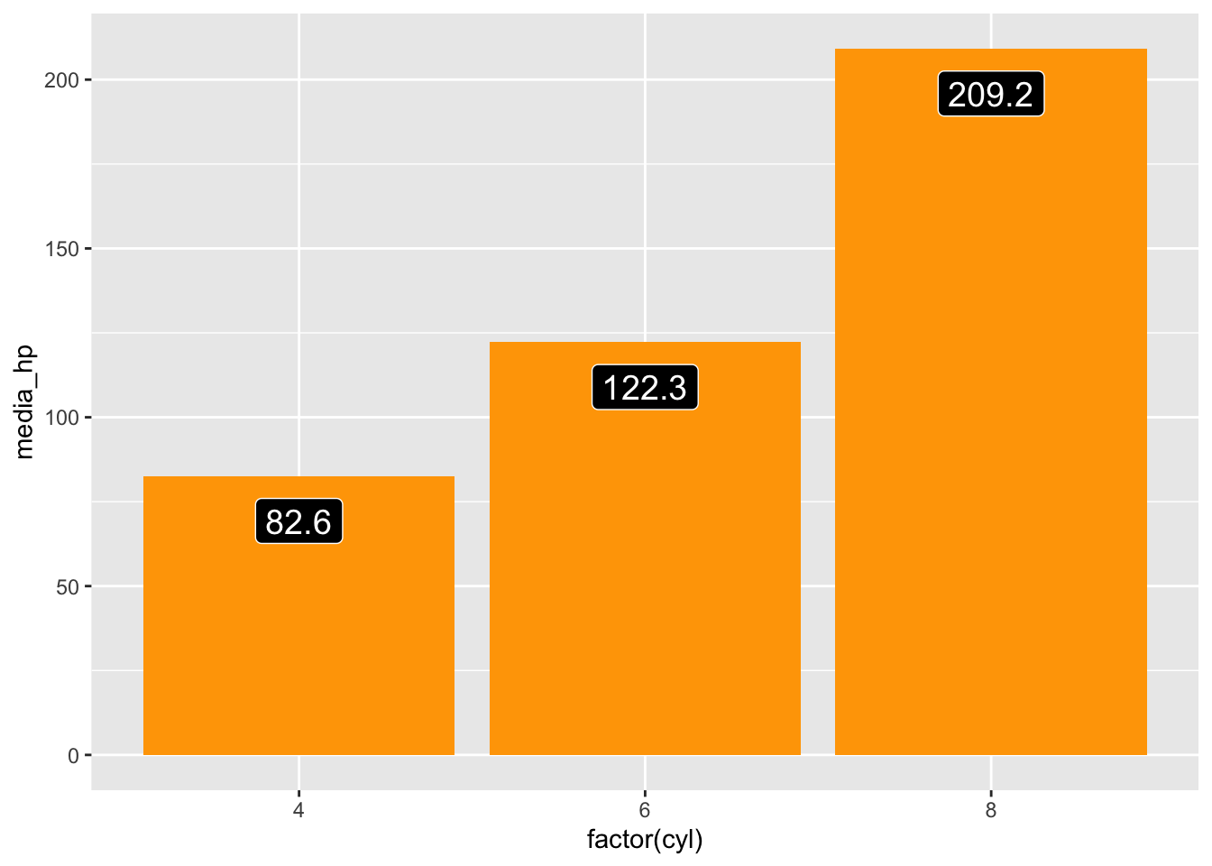
ggplot(mtcars, aes(x = wt, y = mpg, label = rownames(mtcars))) +
  geom_point(color = "red") +
  geom_text(vjust = -0.5, size = 3)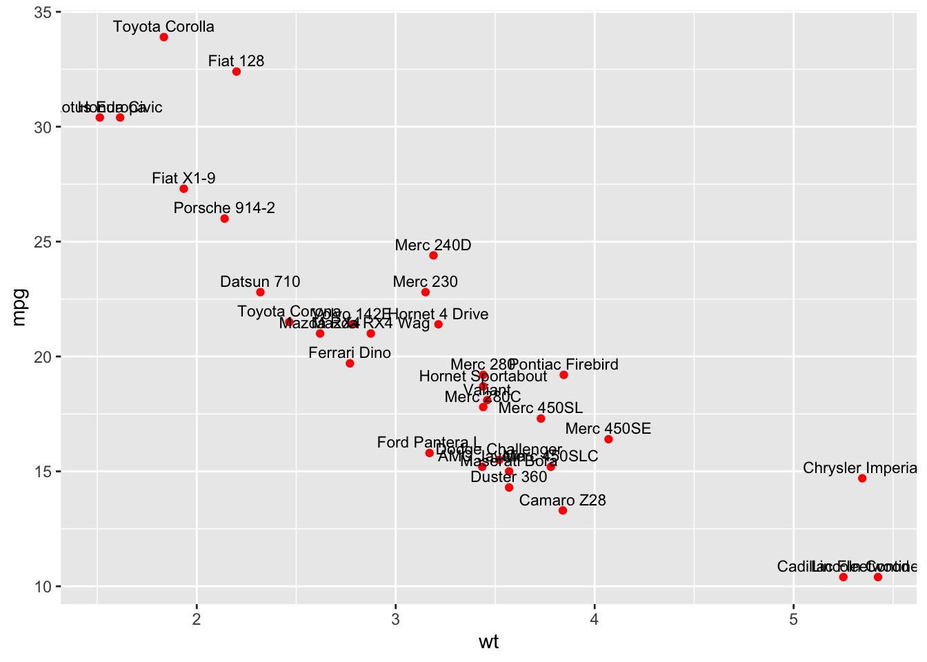
ggplot(mtcars, aes(x = wt, y = mpg, label = rownames(mtcars))) +
  geom_point(color = "red") +
  geom_label(vjust = -0.5, size = 3)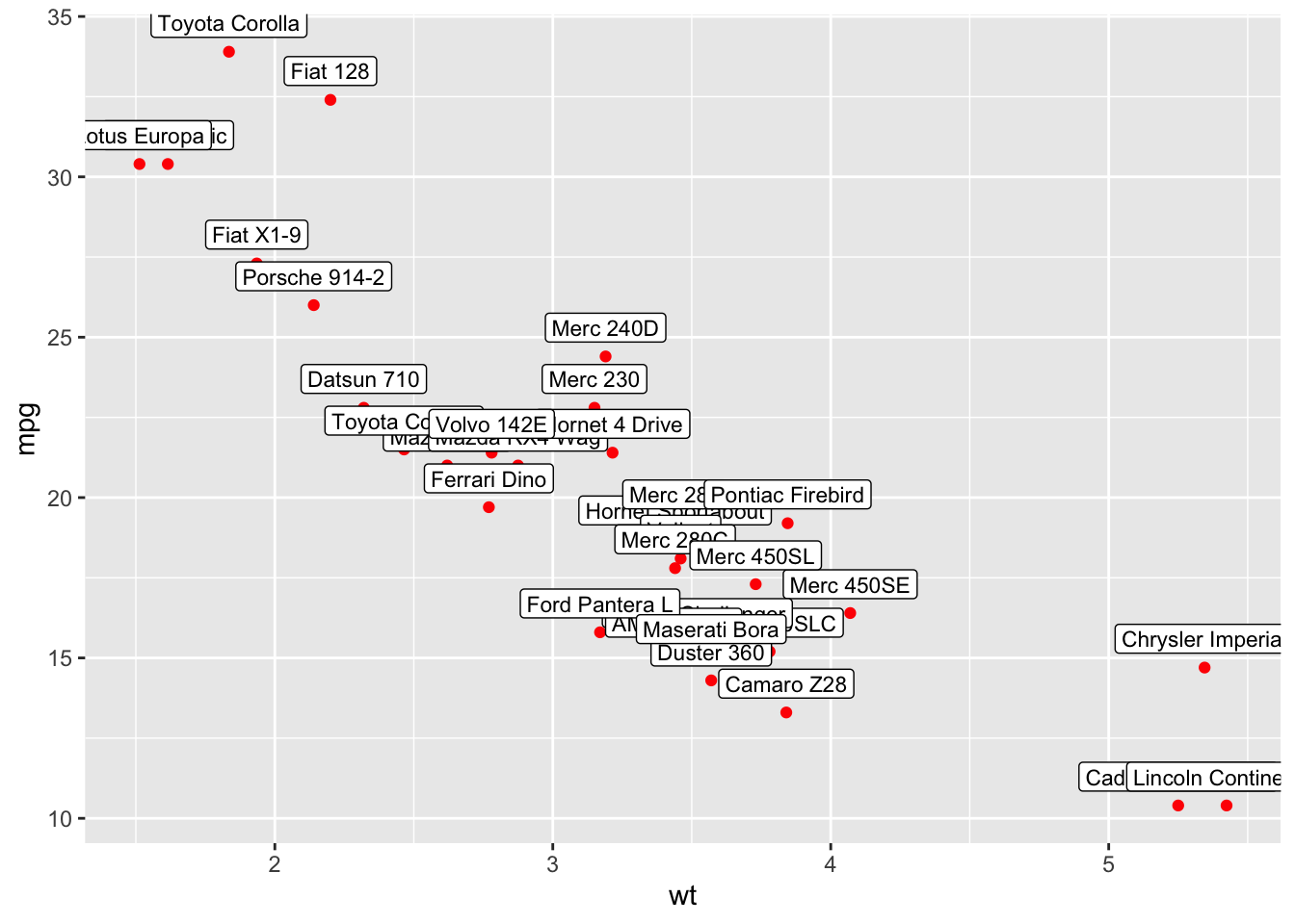
annotate: Serve para colocar textos, formas ou setas fixas no gráfico, sem necessidade de estarem ligados diretamente aos dados.
Estrutura: annotate(geom, x, y, …)
geom→ qual tipo de anotação você quer ("text","label","rect","segment","point"etc.).x,y→ posição da anotação no gráfico.
ggplot(mtcars, aes(x = wt, y = mpg)) +
  geom_point() +
  annotate("text", x = 2, y = 15, label = "Carros pesados consomem mais",
           color = "red", size = 3, fontface = "bold")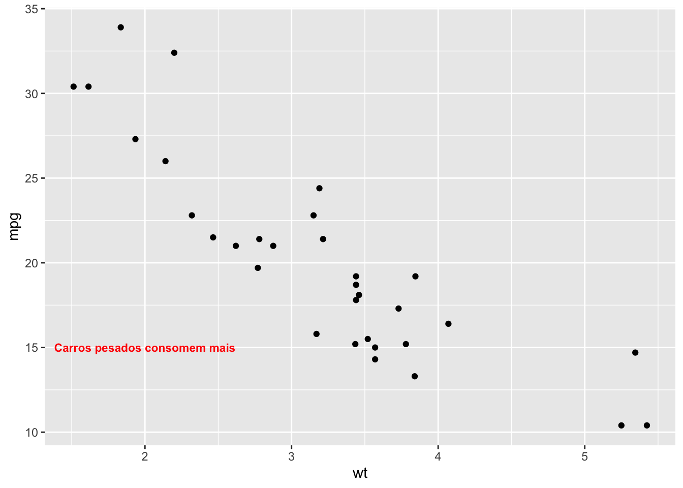
ggplot(mtcars, aes(x = wt, y = mpg)) +
  geom_point() +
  annotate("label", x = 3, y = 20, label = "Zona de interesse",
           fill = "yellow", color = "black")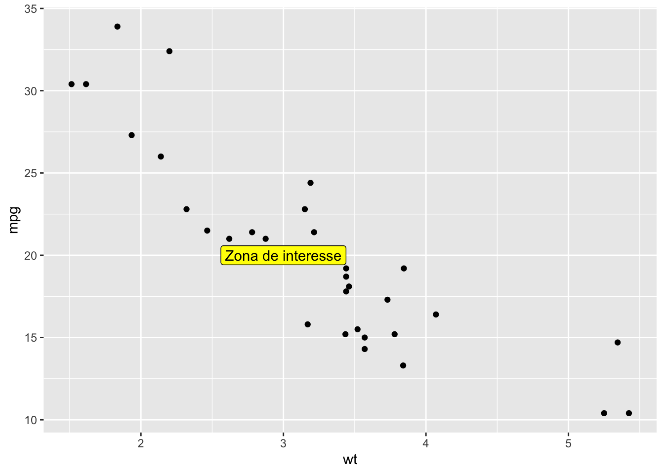
ggplot(mtcars, aes(x = wt, y = mpg)) +
  geom_point() +
  annotate("rect", xmin = 2, xmax = 3, ymin = 15, ymax = 25,
           alpha = 0.2, fill = "red")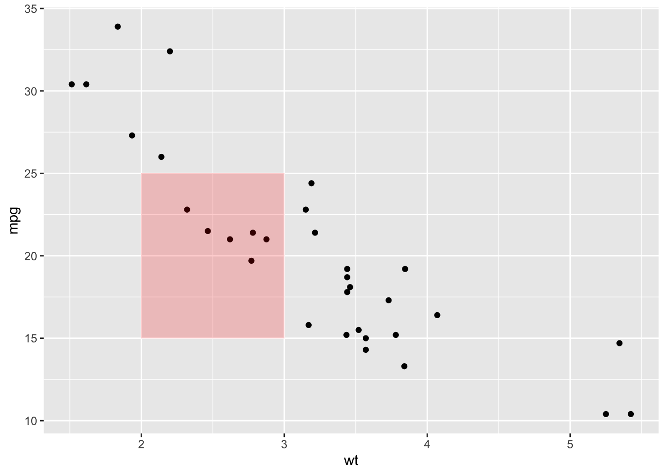
ggplot(mtcars, aes(x = wt, y = mpg)) +
  geom_point() +
  annotate("segment", x = 5, xend = 4, y = 15, yend = 30,
           arrow = arrow(length = unit(2, "cm")), color = "blue")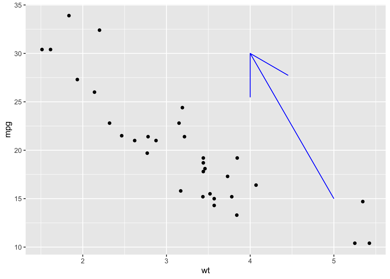
ggplot(mtcars, aes(x = wt, y = mpg)) +
  geom_point() +
  annotate("point", x = 4.5, y = 28,
           color = "purple", size = 8, shape = 8)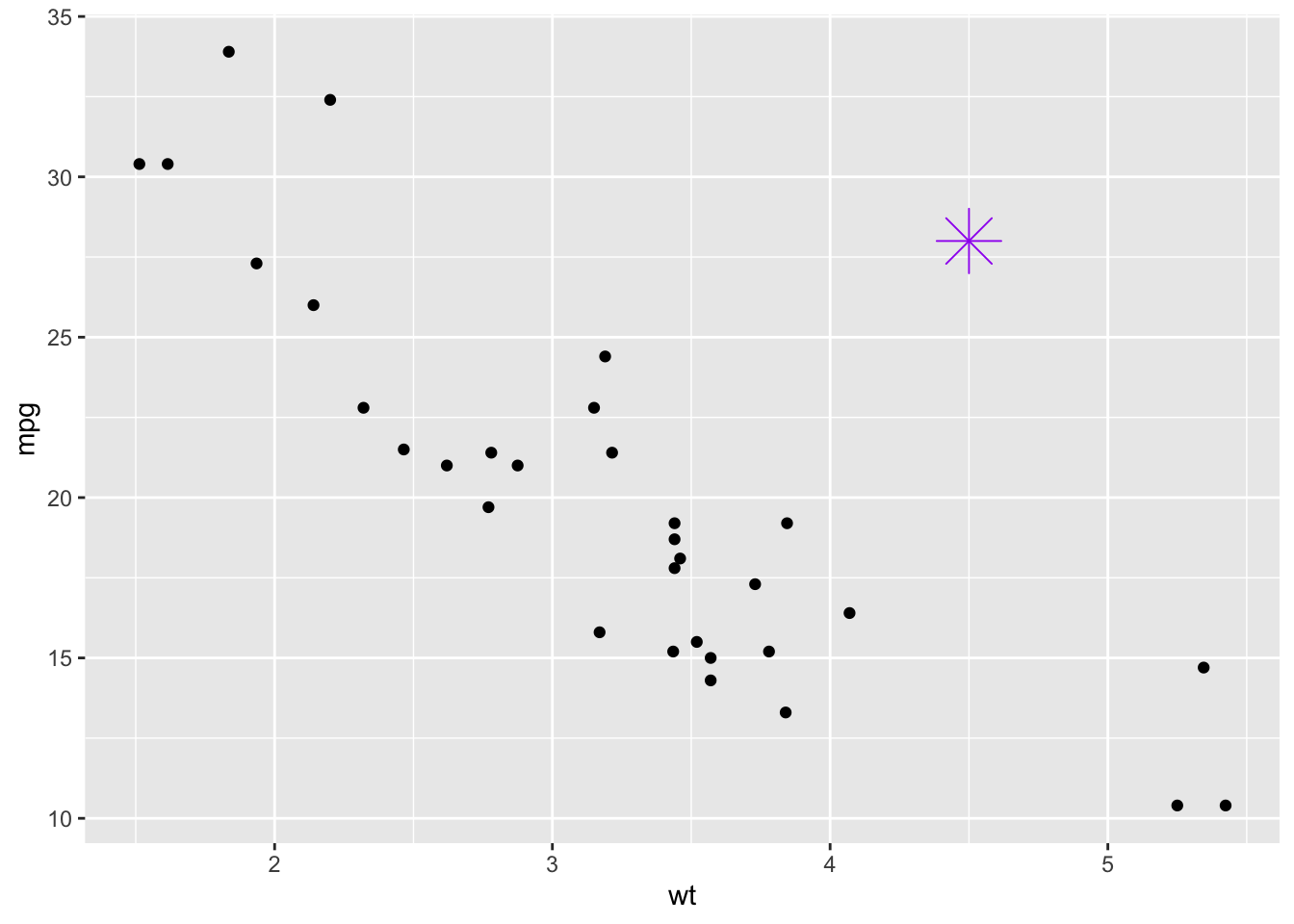
ggplot(mtcars, aes(x = wt, y = mpg)) +
  geom_point(color = "gray40") +   # pontos originais

  #Retângulo para destacar a "zona intermediária"
  annotate("rect", xmin = 3, xmax = 4, ymin = 15, ymax = 25,
           alpha = 0.2, fill = "orange") +

  # Texto explicando essa região
  annotate("text", x = 3.5, y = 24.5,
           label = "Zona de consumo moderado",
           size = 4, color = "black", fontface = "italic") +

  #Label para destacar carros mais eficientes (leves e com mpg alto)
  annotate("label", x = 2.2, y = 30,
           label = "Alta eficiência:\ncarros leves",
           fill = "lightgreen", color = "black", fontface = "bold") +

  #Ponto extra representando um "carro conceitual"
  annotate("point", x = 4.5, y = 28,
           color = "red", size = 4, shape = 17) +

  # Seta indicando esse ponto extra
  annotate("segment", x = 4.2, xend = 4.5, y = 26, yend = 28,
           arrow = arrow(length = unit(0.3, "cm")),
           color = "blue", size = 1) +

  # Texto explicando o ponto extra
  annotate("text", x = 4, y = 31,
           label = "Protótipo eficiente\nmesmo pesado",
           color = "blue", hjust = 0, size = 3.5)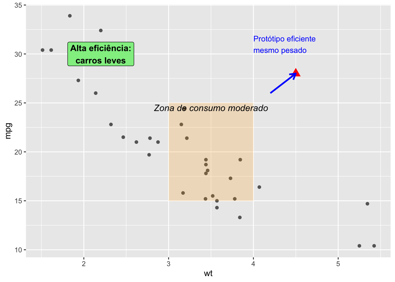
summary(mpg) manufacturer model displ year
Length:234 Length:234 Min. :1.600 Min. :1999
Class :character Class :character 1st Qu.:2.400 1st Qu.:1999
Mode :character Mode :character Median :3.300 Median :2004
Mean :3.472 Mean :2004
3rd Qu.:4.600 3rd Qu.:2008
Max. :7.000 Max. :2008
cyl trans drv cty
Min. :4.000 Length:234 Length:234 Min. : 9.00
1st Qu.:4.000 Class :character Class :character 1st Qu.:14.00
Median :6.000 Mode :character Mode :character Median :17.00
Mean :5.889 Mean :16.86
3rd Qu.:8.000 3rd Qu.:19.00
Max. :8.000 Max. :35.00
hwy fl class
Min. :12.00 Length:234 Length:234
1st Qu.:18.00 Class :character Class :character
Median :24.00 Mode :character Mode :character
Mean :23.44
3rd Qu.:27.00
Max. :44.00 unique(mpg$manufacturer) [1] "audi" "chevrolet" "dodge" "ford" "honda"
[6] "hyundai" "jeep" "land rover" "lincoln" "mercury"
[11] "nissan" "pontiac" "subaru" "toyota" "volkswagen"(p <- ggplot(mpg, aes(x = displ, y = hwy)) +
geom_point(
data = filter(mpg, manufacturer == "toyota"),
colour = "orange",
size = 3
) +
geom_point())
p +
  annotate(geom = "point", x = 5.5, y = 40, colour = "orange", size = 3) +
  annotate(geom = "point", x = 5.5, y = 40) +
  annotate(geom = "text", x = 5.6, y = 40, label = "toyota", hjust = "left")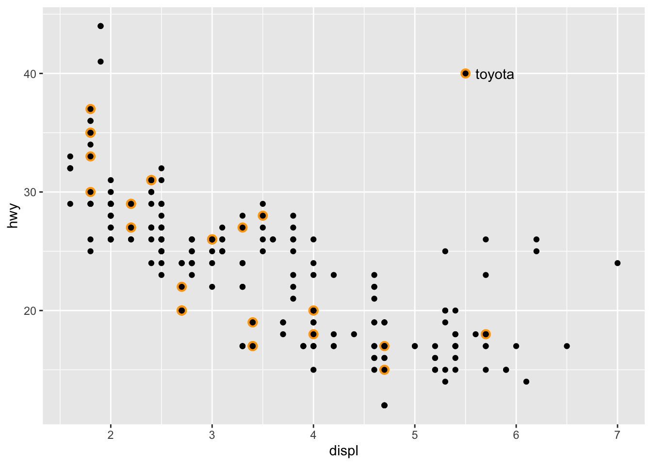
(ggplot(mpg, aes(displ, hwy)) +
  geom_point(
    data = filter(mpg, manufacturer == "subaru"),
    colour = "lightgreen", size = 3) +
  geom_point() +
  annotate(
    geom = "curve", x = 4, y = 35, xend = 2.65, yend = 27,
    curvature = .3, arrow = arrow(length = unit(2, "mm"))
  ) +
  annotate(geom = "label", x = 4.1, y = 35, label = "subaru", hjust = "left", color = "lightgreen", fill = "black")) +
  theme_classic()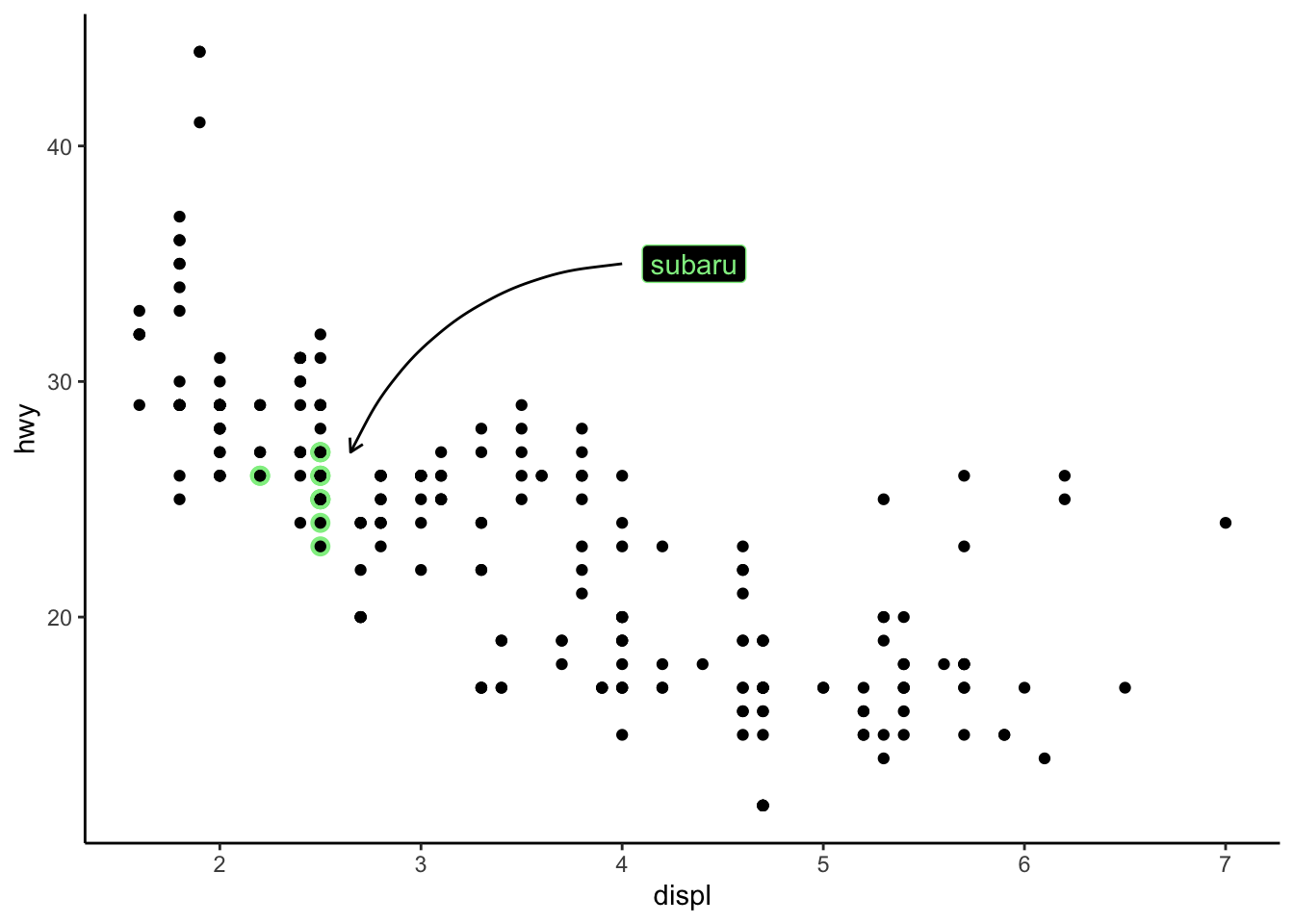
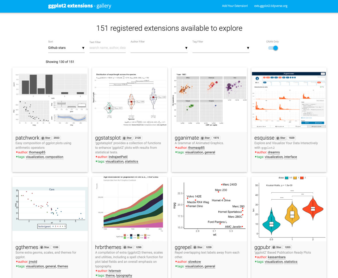
3.2 Extensões
Um ponto de destaque do ggplot2 é o vasto conjunto de extensões disponíveis, que ampliam suas possibilidades, permitindo ir muito além das visualizações tradicionais. Essa capacidade de expansão transformou o ggplot2 em uma ferramenta extremamente versátil, adequada tanto para trabalhos acadêmicos quanto para comunicação científica e empresarial.
3.2.1 Temas extras
library(ggthemes)(g <- ggplot(mtcars, aes(x = wt, y = mpg, color = factor(cyl))) +
geom_point(size = 3) +
labs(
title = " ",
x = "Peso",
y = "Consumo",
color = "Cilindros")) 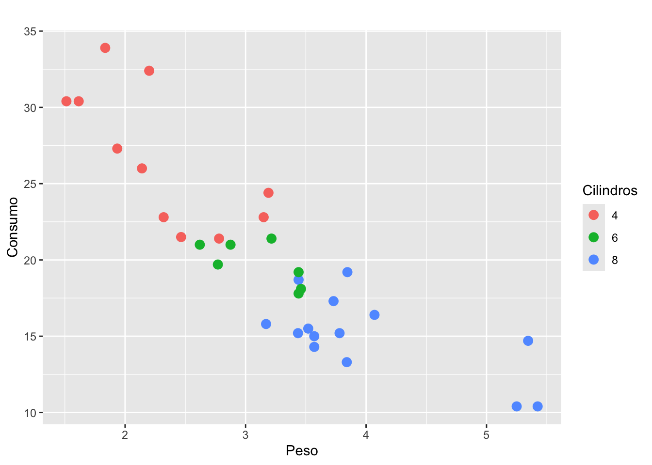
g + theme_clean()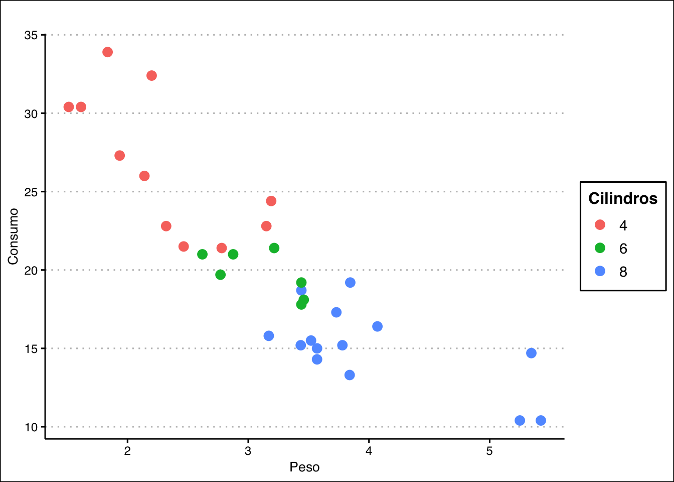
g + theme_tufte()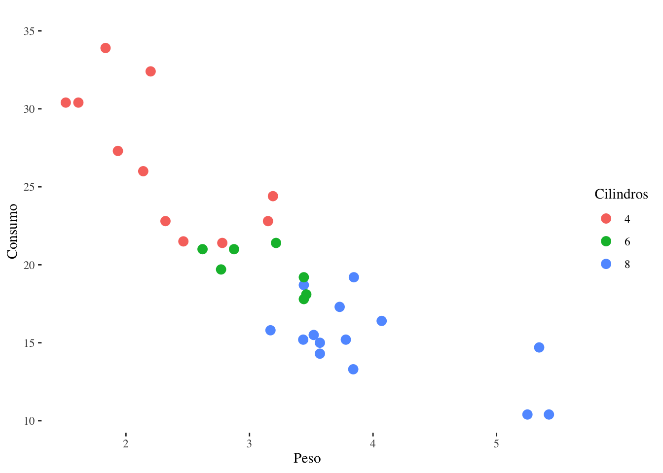
g + theme_wsj() + scale_color_wsj()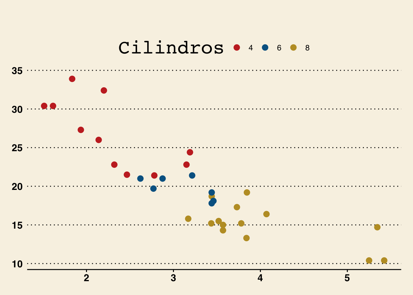
g + theme_economist() + scale_color_economist()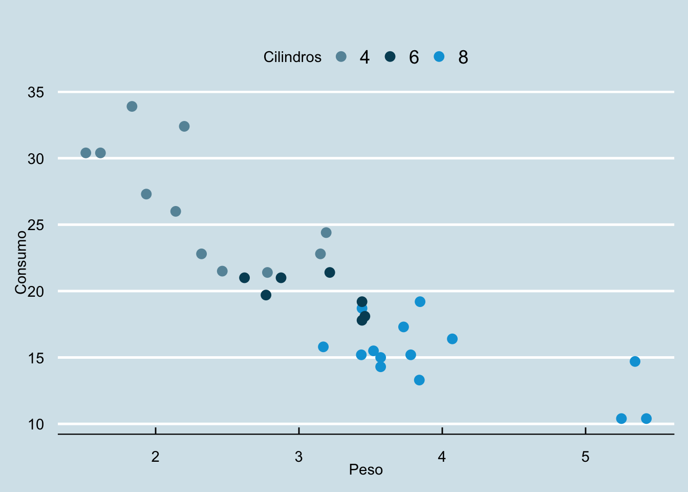
g + theme_calc() + scale_color_calc()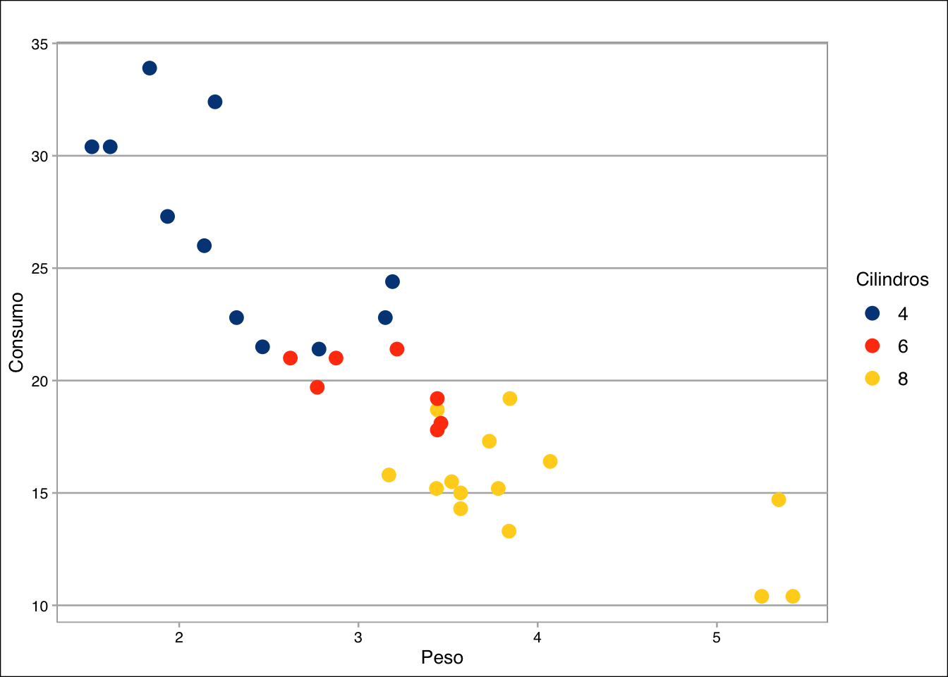
g + theme_few() + scale_colour_few()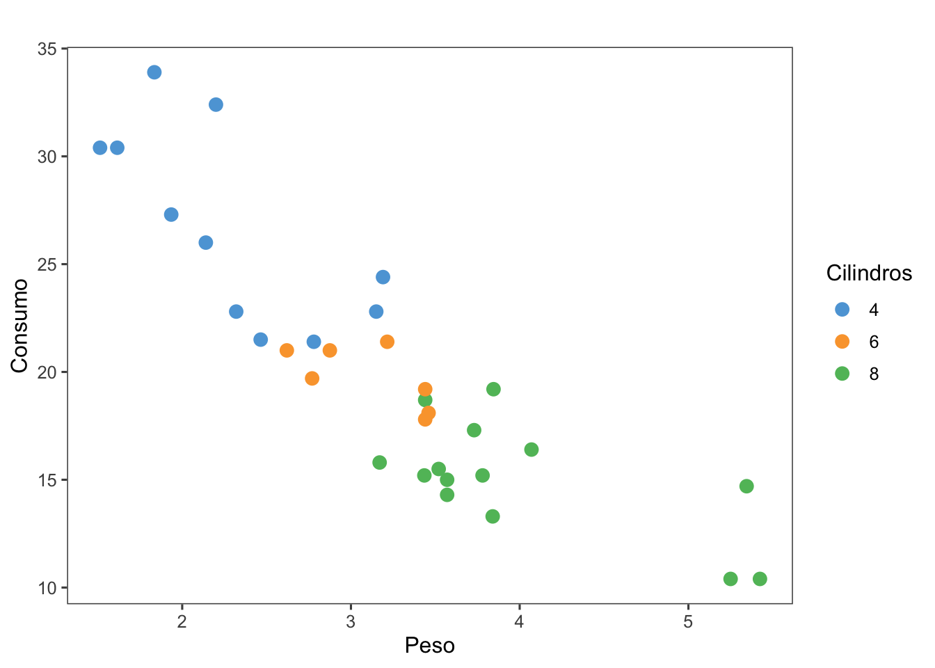
g + theme_solarized(light=FALSE) + scale_colour_solarized()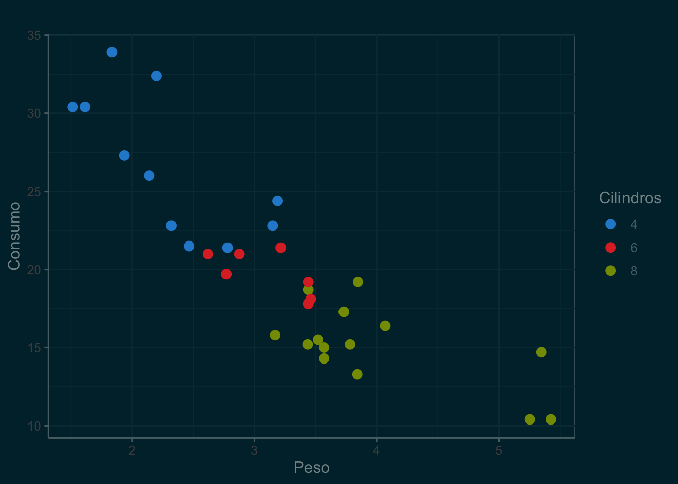
3.2.2 Grade de gráficos
library(patchwork)view(gapminder::gapminder)
(g1 <- gapminder::gapminder %>%
group_by(continent, year) %>%
summarise(lifeExp = mean(lifeExp)) %>%
ggplot(aes(x = year, y = lifeExp, color = continent)) +
geom_line(size = 1) +
labs(x = "",
y = "Expectativa de vida",
color = "") +
theme_minimal()) 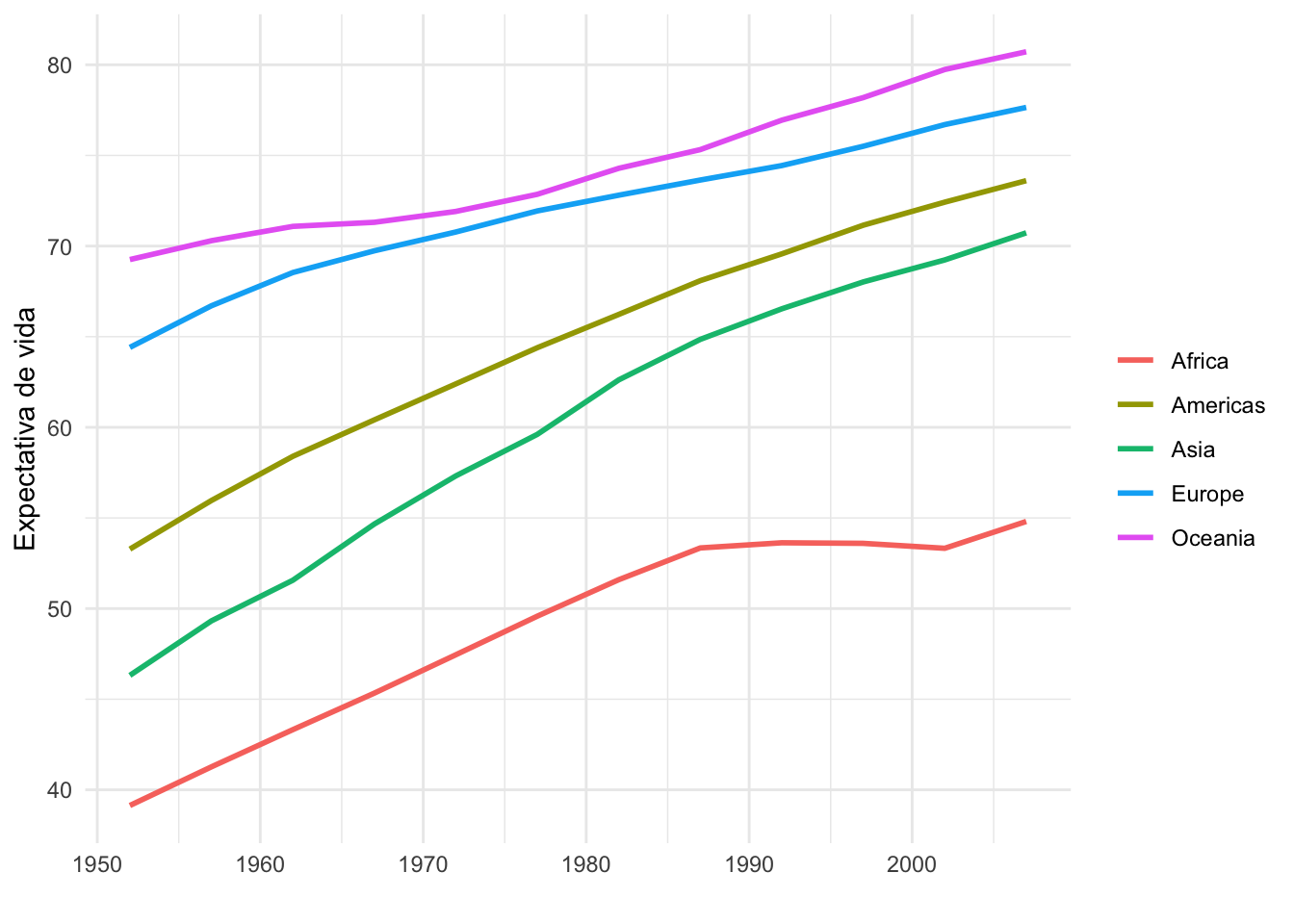
(g2 <- gapminder::gapminder %>%
  group_by(continent, year) %>%
  summarise(pop = mean(pop)) %>%
  ggplot(aes(x = year, y = pop, color = continent)) +
  geom_line(size = 1) +
  labs(x = "",
       y = "População",
       color = "") +
theme_minimal()) 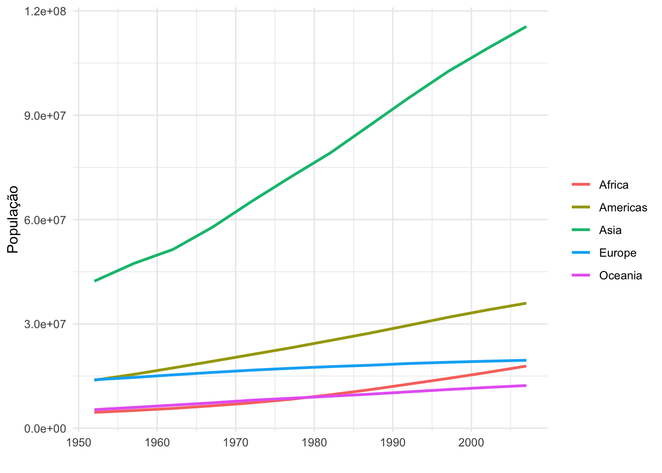
(g3 <- gapminder::gapminder %>%
  group_by(continent, year) %>%
  summarise(gdpPercap = mean(gdpPercap)) %>%
  ggplot(aes(x = year, y = gdpPercap, color = continent)) +
  geom_line(size = 1) +
  labs(x = "",
       y = "PIB per capita",
       color = "") +
theme_minimal()) 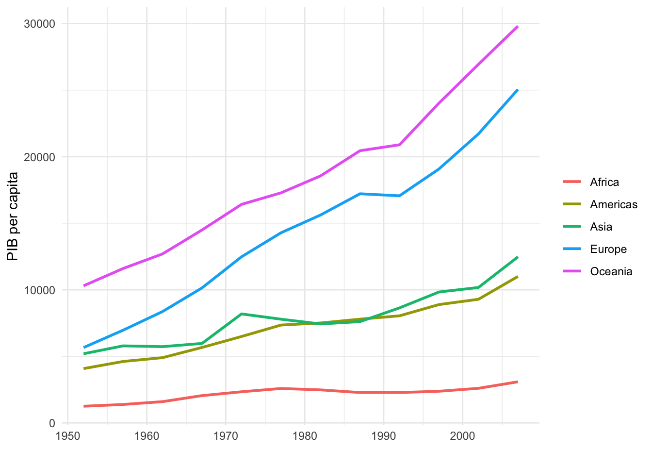
g1 + g2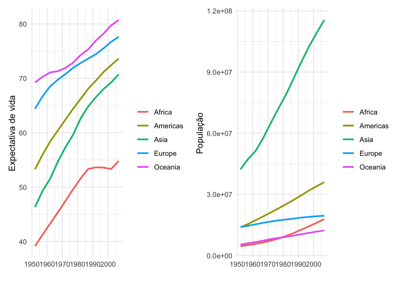
g1 + g2 +
  plot_layout(widths = c(3,1))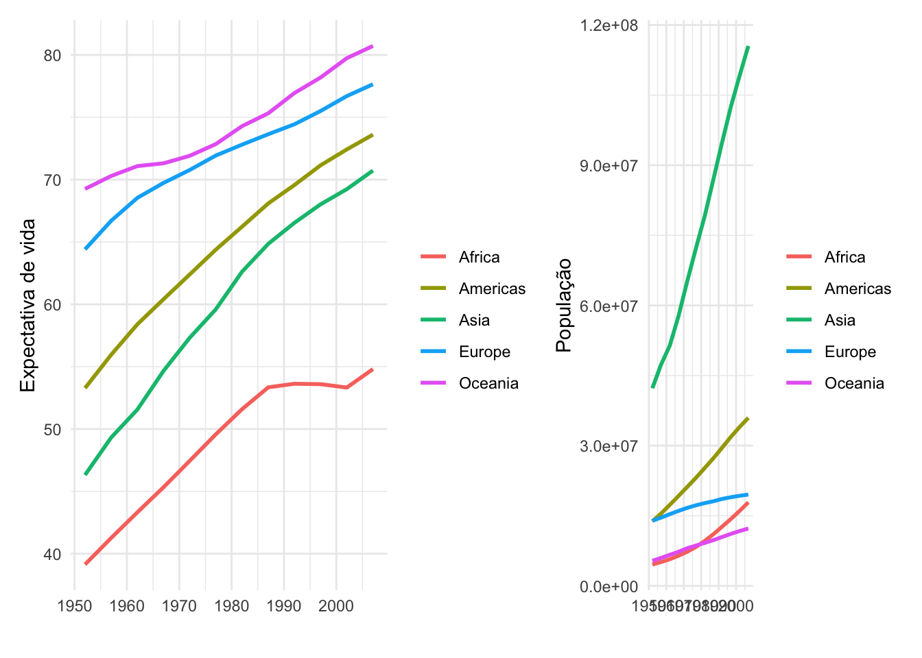
g1 / g2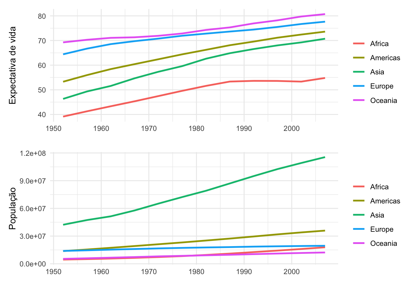
g1 / g2 +
  plot_layout(heights = c(2,1))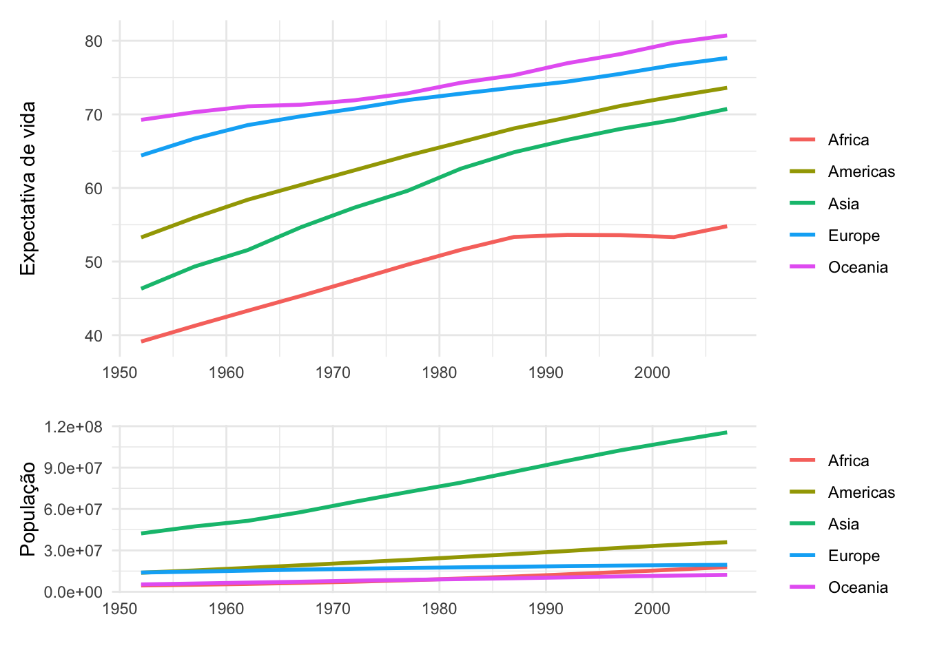
g1 + g2 + g3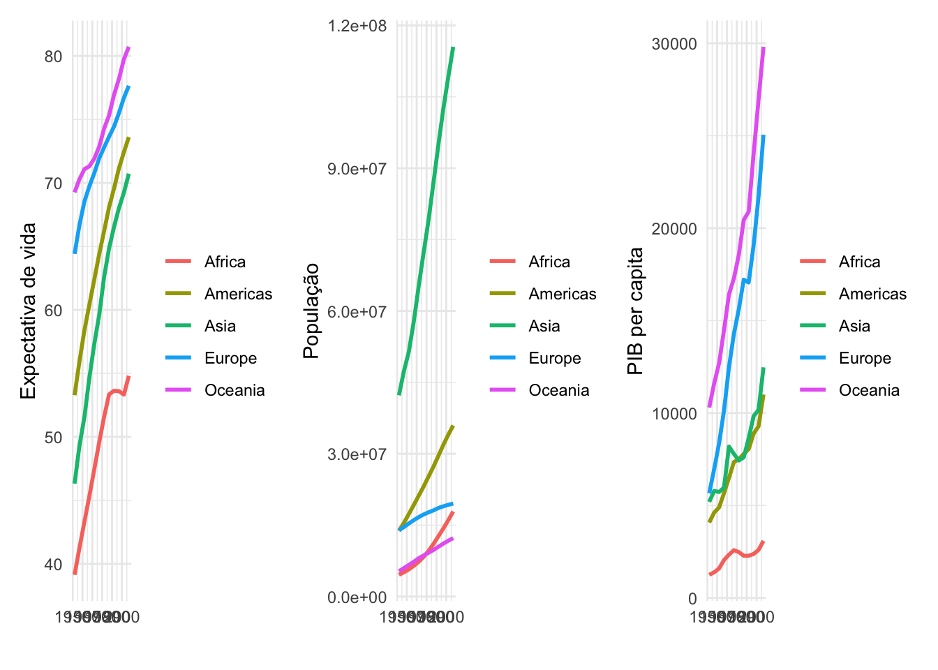
g1 / g2 / g3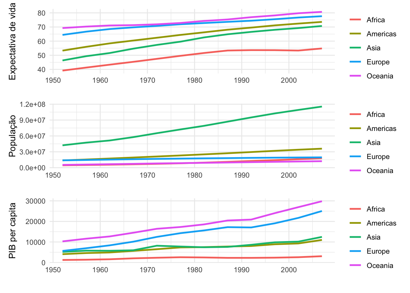
Fontes do R:
sans (padrão)
serif
mono
Fontes do sistema operacional:
fontes <- systemfonts::system_fonts()Baixar fontes do google: https://fonts.google.com
library(showtext)

font_add_google("Shadows Into Light", "shadows")

showtext_auto()
g1 + g2 / g3 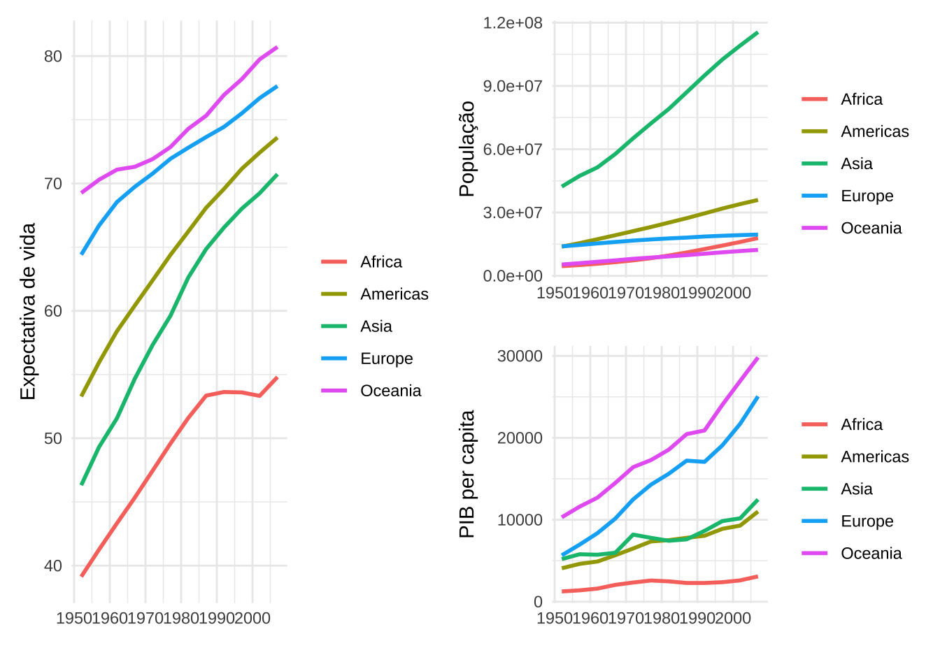
g1 + g2 / g3 +
  plot_layout(guides = 'collect') +
  plot_annotation(
  title = "Comparação entre os continentes",
  subtitle = "Evolução da expectativa de vida, da população e do PIB per capita",
  theme = theme(plot.title = element_text(hjust = 0.5),
                plot.subtitle = element_text(hjust = 0.5),
                text = element_text(face = "bold", size = 14,
                          family = "shadows", hjust = 0.5)),
  tag_levels = 'A',
  tag_prefix = "(",
  tag_suffix = ")")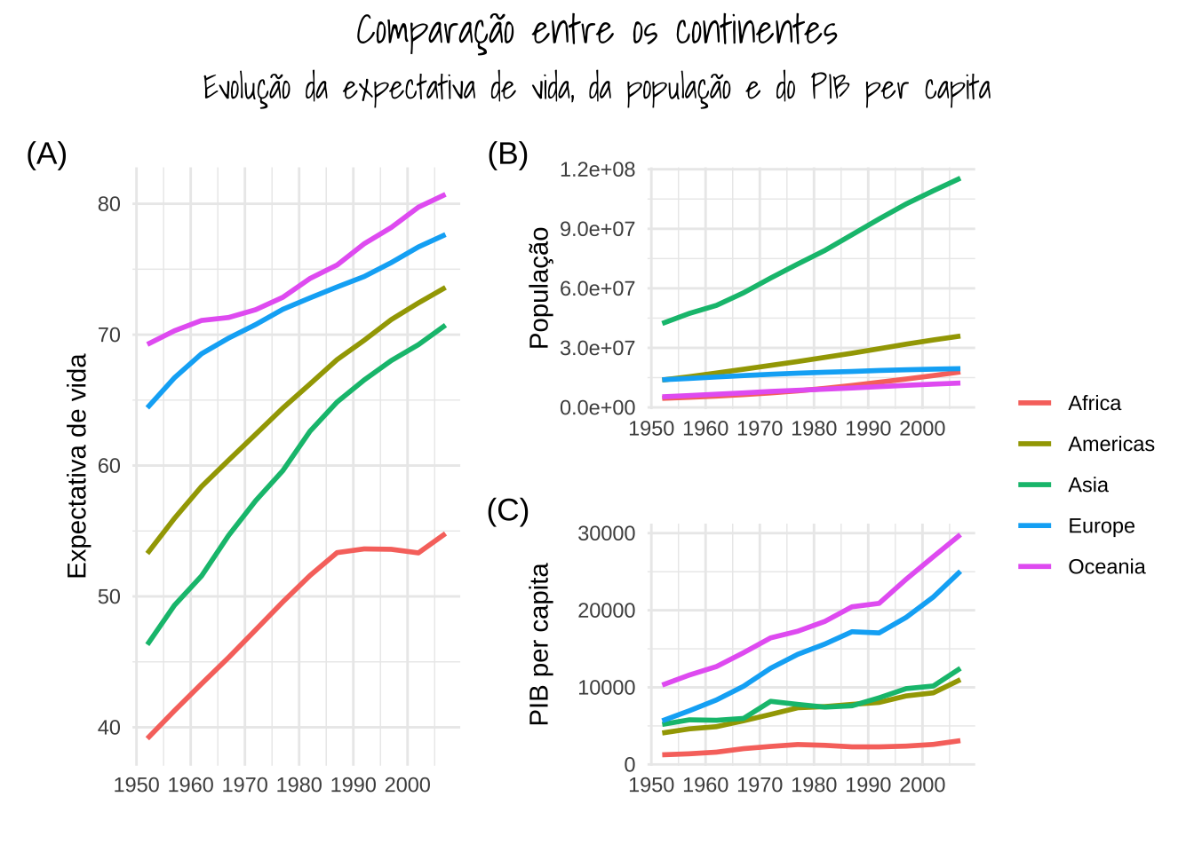
(g1 <- ggplot(mtcars, aes(x = hp, y = mpg, color = factor(cyl))) +
  geom_point(size = 3, alpha = 0.7) +
  labs(title = " ", x = "Potência",
       y = "Consumo", color = "Cilindros") +
  theme_classic())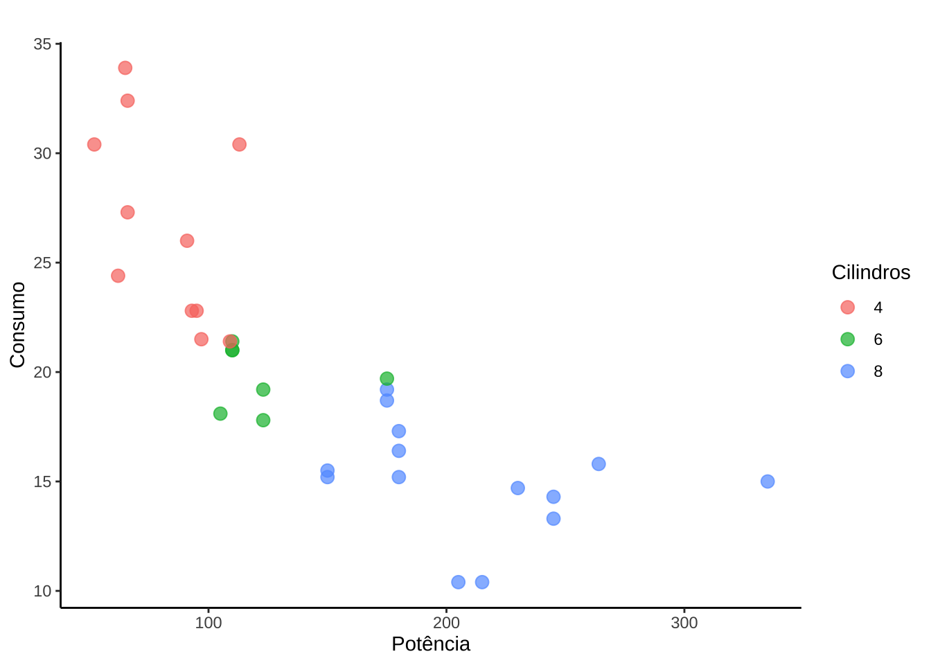
(g2 <- ggplot(mtcars, aes(x = hp, y = mpg, fill = factor(cyl))) +
  geom_boxplot(alpha = 0.7) +
  labs(x = "Potência", y = "Consumo") +
  theme_classic(base_size = 10) +
  theme(legend.position = "none"))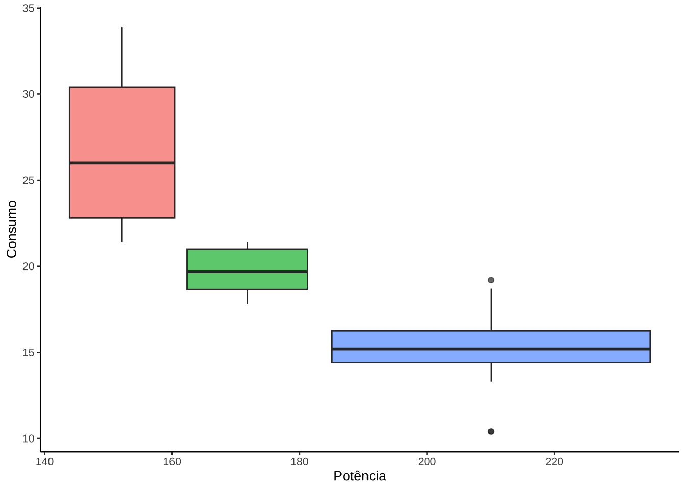
g1 +
  inset_element(g2, left = 0.3, bottom = 0.4, right  = 0.95, top = 1)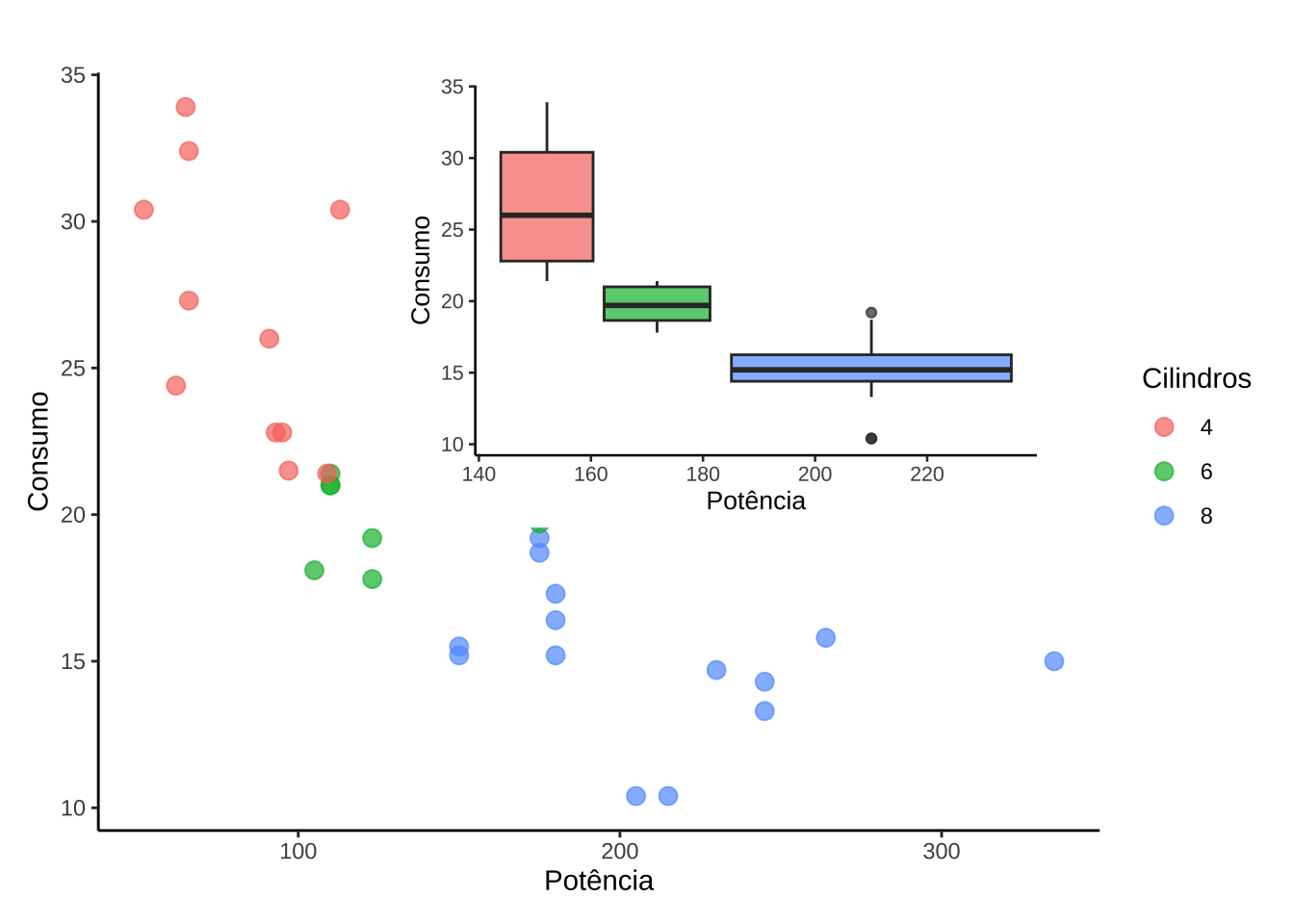
3.2.3 Realce
library(gghighlight)(m <- ggplot(mtcars, aes(x = wt, y = mpg, color = as.factor(cyl))) +
geom_point(size = 3) +
labs(
title = "Consumo de combustível com base no peso e no número de cilindros",
x = "Peso",
y = "Consumo",
color = "Cilindros"
) +
theme_minimal() +
theme(plot.title = element_text(hjust = 0.5)))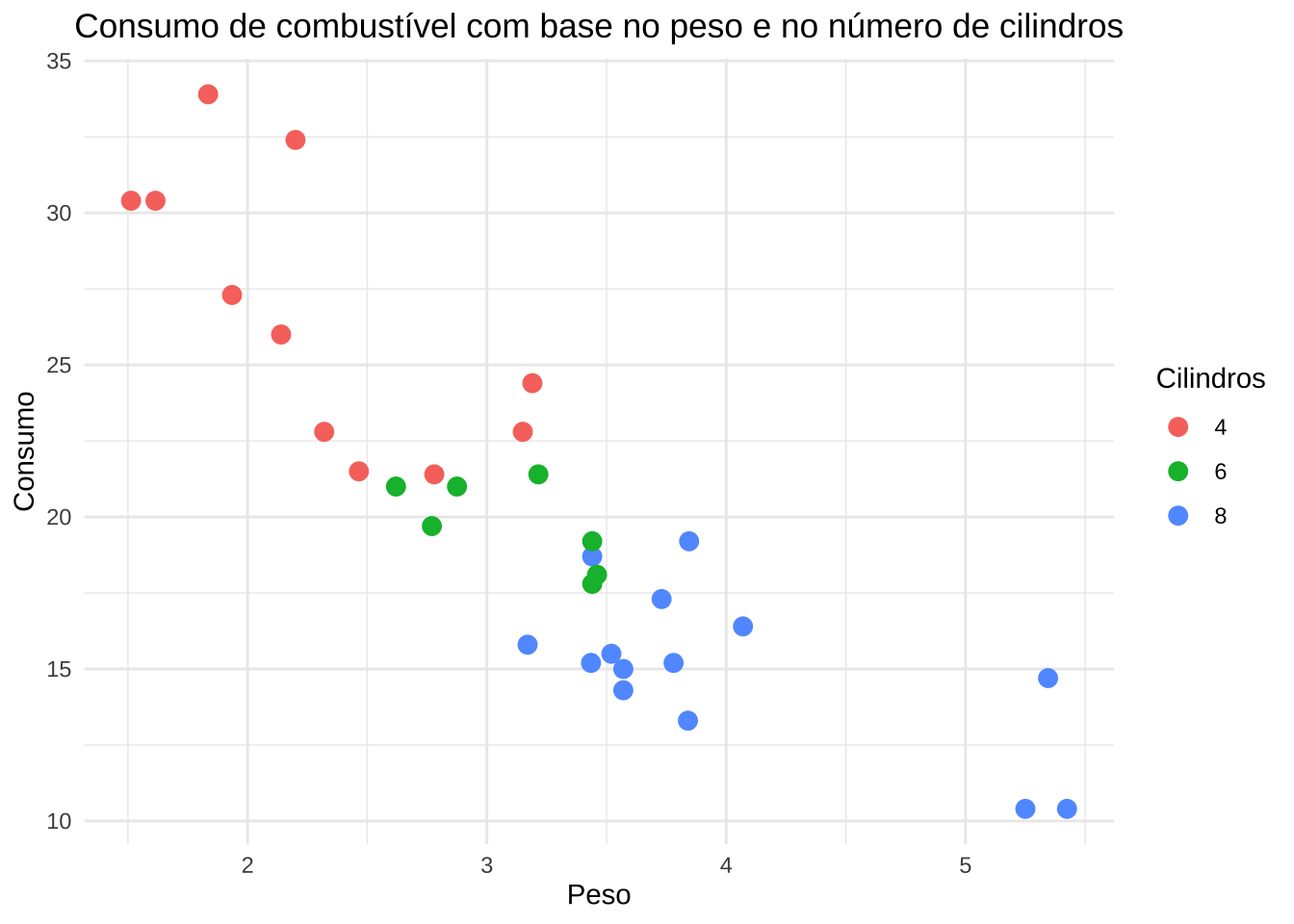
m + gghighlight(mpg > 20)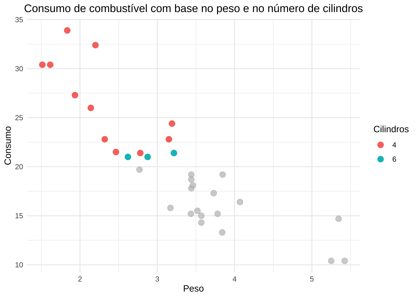
mt <- mtcars
mt$car <- rownames(mt)
rownames(mt) <- NULL

head(mt)
mpg cyl disp hp drat wt qsec vs am gear carb car
1 21.0 6 160 110 3.90 2.620 16.46 0 1 4 4 Mazda RX4
2 21.0 6 160 110 3.90 2.875 17.02 0 1 4 4 Mazda RX4 Wag
3 22.8 4 108 93 3.85 2.320 18.61 1 1 4 1 Datsun 710
4 21.4 6 258 110 3.08 3.215 19.44 1 0 3 1 Hornet 4 Drive
5 18.7 8 360 175 3.15 3.440 17.02 0 0 3 2 Hornet Sportabout
6 18.1 6 225 105 2.76 3.460 20.22 1 0 3 1 Valiantdados_long <- mt %>%
dplyr::select(car, mpg, wt, qsec, cyl) %>%
pivot_longer(cols = c(qsec, mpg, wt), names_to = "variable", values_to = "value")
head(dados_long)# A tibble: 6 × 4
car cyl variable value
<chr> <dbl> <chr> <dbl>
1 Mazda RX4 6 qsec 16.5
2 Mazda RX4 6 mpg 21
3 Mazda RX4 6 wt 2.62
4 Mazda RX4 Wag 6 qsec 17.0
5 Mazda RX4 Wag 6 mpg 21
6 Mazda RX4 Wag 6 wt 2.88(mt <- ggplot(dados_long, aes(x = variable, y = value, group = car, color = factor(cyl))) +
geom_line(size = 1) +
theme_minimal() +
labs(x = NULL, y = "Valor", color = "Cylinders", title = " "))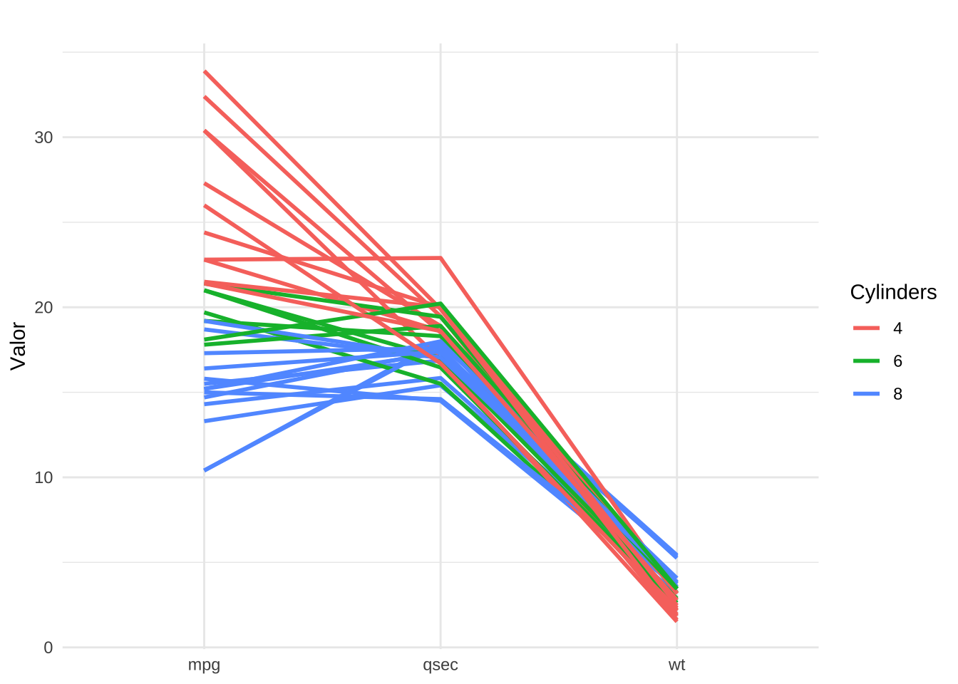
mt + gghighlight(max(value) > 30, label_key = car) 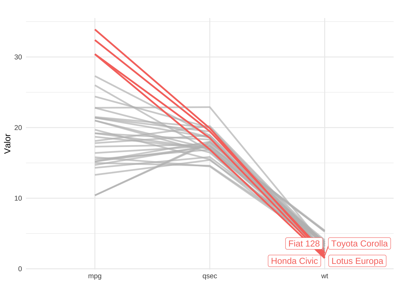
3.2.4 Zoom
library(ggforce)ggplot(mtcars, aes(x = hp, y = mpg, color = as.factor(cyl))) +
geom_point(size = 2) +
labs(
x = "Potência (HP)",
y = "Consumo (MPG)",
color = "Número de Cilindros"
) +
facet_zoom(xlim = c(100, 125))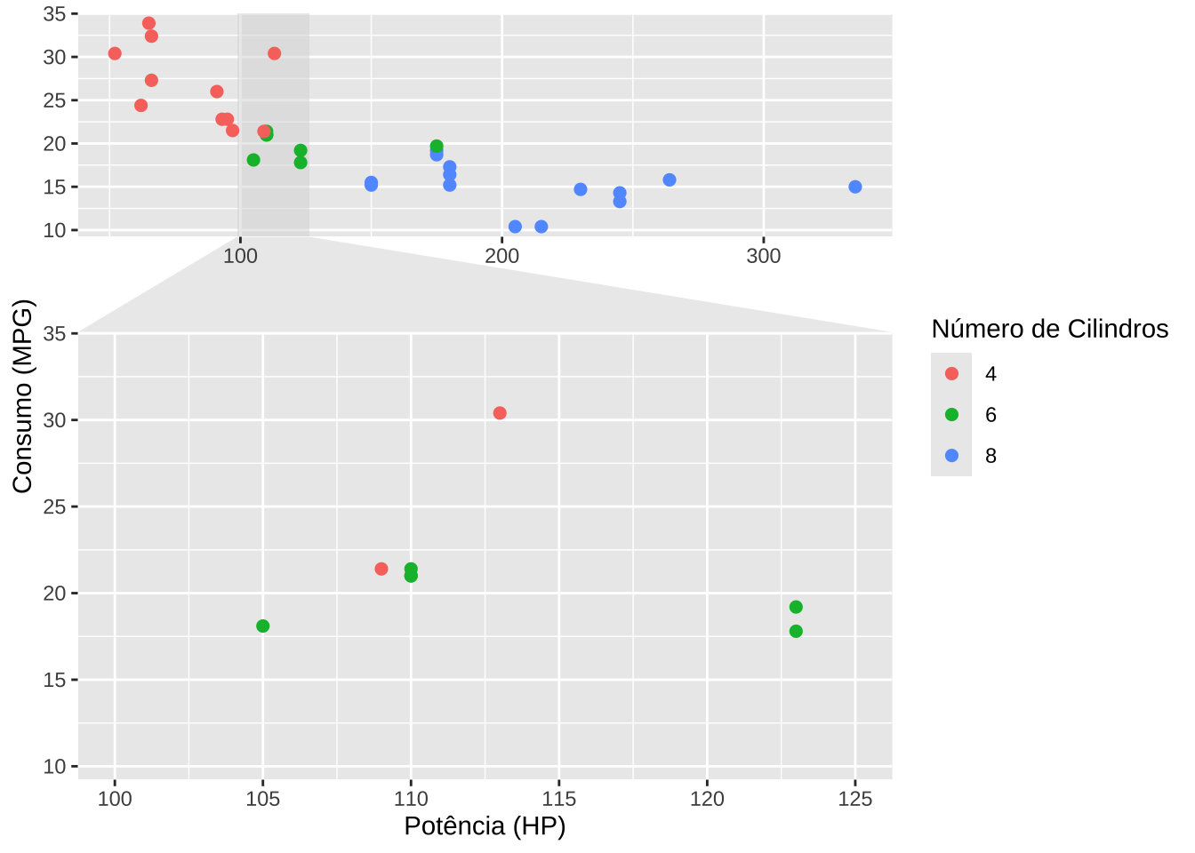
ggplot(mtcars, aes(hp, mpg, color = as.factor(cyl))) +
  geom_point(size = 2) +
  labs(
    x = "Potência (HP)",
    y = "Consumo (MPG)",
    color = "Número de Cilindros"
  ) +
  facet_zoom(ylim = c(20, 30))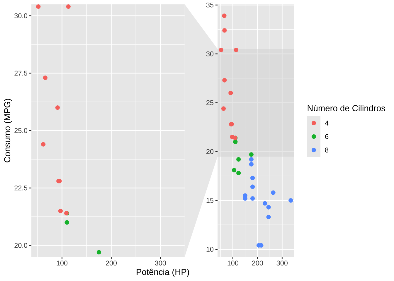
3.2.5 Repelir rótulos de texto sobrepostos
library(ggrepel)ggplot(mtcars, aes(x = wt, y = mpg, label = rownames(mtcars))) +
geom_point(color = "red", size = 3) +
geom_text_repel(
size = 3,
color = "black",
fontface = "bold",
box.padding = 0.5,
point.padding = 0.3,
segment.color = "grey50",
segment.size = 0.5) +
labs(title = " ", x = "Peso ", y = "Milhas por galão") +
theme_minimal()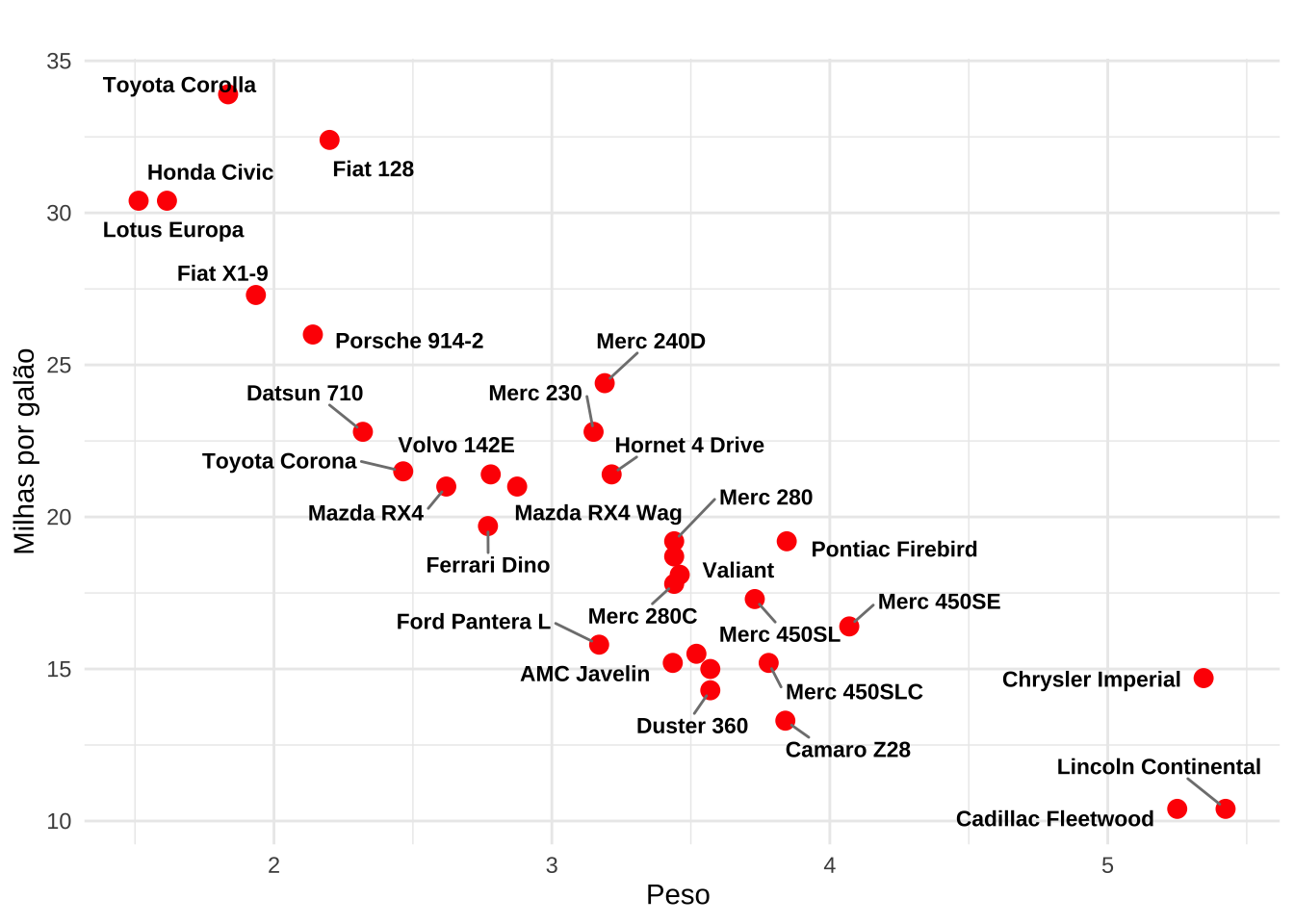
ggplot(mtcars, aes(x = wt, y = mpg, label = rownames(mtcars))) +
  geom_point(color = "red", size = 3) +
  geom_label_repel(
    size = 3,
    fill = "white",
    color = "black",
    fontface = "bold",
    box.padding = 0.5,
    point.padding = 0.3,
    segment.color = "grey50",
    segment.size = 0.5) +
  labs(title = " ", x = "Peso ", y = "Milhas por galão") +
  theme_minimal()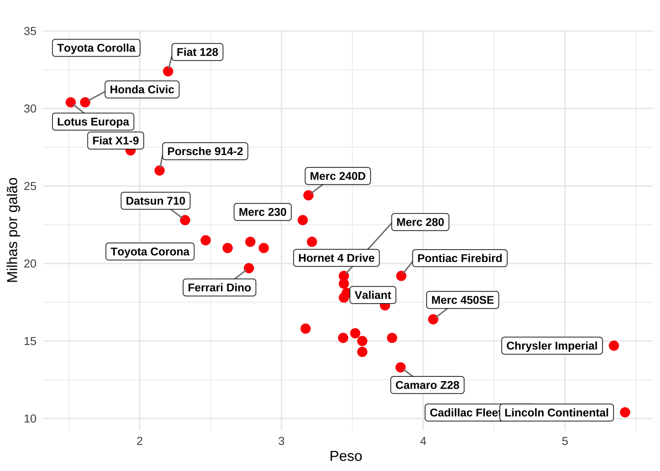
3.2.6 Texto em linha
library(geomtextpath)df <- gapminder::gapminder %>% filter(country %in% c("Brazil", "United States", "China", "India", "France", "England"))
ggplot(df, aes(x = year, y = gdpPercap, color = country)) +
geom_labelline(aes(label = country), size = 4) +
labs(x = "Ano", y = "PIB per capita") +
theme_calc() +
theme(legend.position = "none")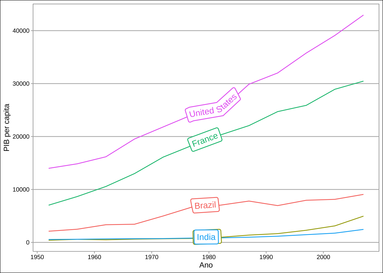
ggplot(df, aes(x = year, y = gdpPercap, color = country)) +
  geom_textline(aes(label = country), hjust = 1, size = 4) +
  labs(x = "Ano", y = "PIB per capita") +
  theme_calc() +
  theme(legend.position = "none")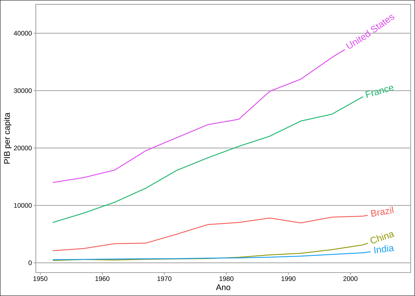
3.2.7 Escalas
library(scales)# Proporção
p <- na.omit(palmerpenguins::penguins) %>%
count(species) %>%
mutate(prop = n / sum(n))
ggplot(p, aes(x = species, y = prop, fill = species)) +
geom_col() +
scale_y_continuous(labels = percent_format()) +
labs(x = "Espécie", y = "Proporção") +
theme(legend.position = "none")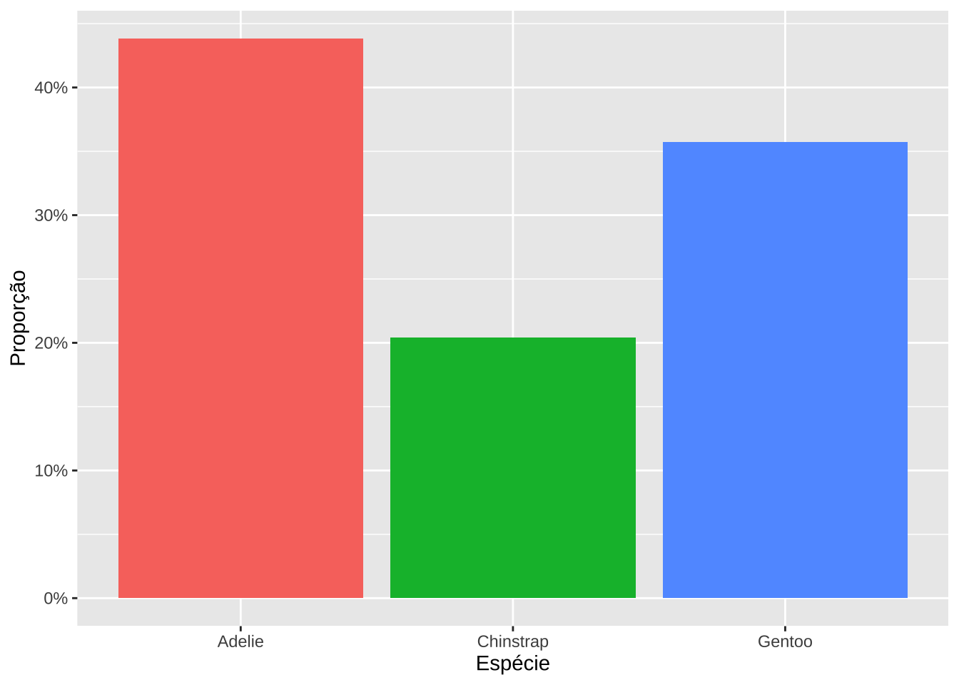
# Moeda
q <- gapminder::gapminder %>%
  group_by(continent, year) %>%
  summarise(mpib = mean(gdpPercap))

ggplot(q, aes(x = year, y = mpib, color = continent)) +
  geom_line() +
  scale_y_continuous(labels = dollar_format(prefix = "US$ ")) +
  labs(x = "Ano", y = "PIB per capita")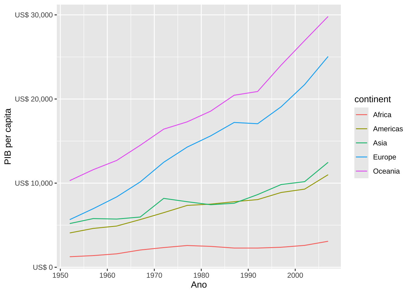
# Notação curta para valores grandes
r <- gapminder::gapminder %>%
  group_by(continent, year) %>%
  summarise(mpop = mean(pop))

ggplot(r, aes(x = year, y = mpop, color = continent)) +
  geom_line() +
  scale_y_continuous(labels = label_number(scale_cut = cut_short_scale())) +
  labs(x = "Ano", y = "População")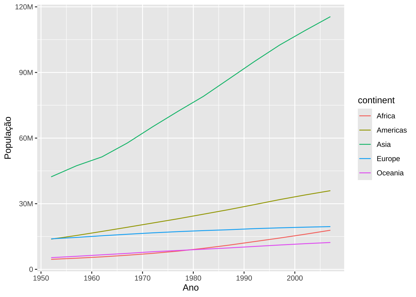
# Sistema Internacional de Unidades (SI)

energy <- data.frame(
  device = c("Geladeira", "Ar condicionado", "Micro-ondas", "Televisão", "Chuveiro"),
  power = c(150, 3500, 1200, 100, 4500)
)

ggplot(energy, aes(x = device, y = power, fill = device)) +
  geom_col() +
  scale_y_continuous(labels = label_number(scale_cut = cut_si("W"))) +
  labs(y = "Potência", x = "Dispositivo") +
  theme(legend.position = "none",
        axis.text.x = element_text(angle = 45, hjust = 1))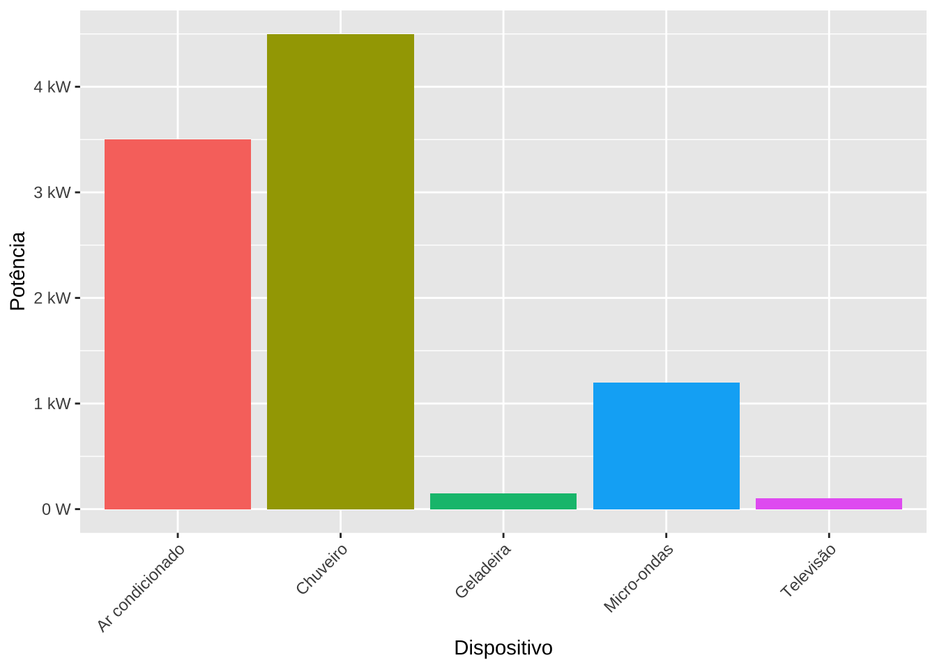
distances <- data.frame(
  pessoa = c("Alice", "Bruno", "Carla", "Diego", "Helena"),
  distancia = c(500, 1200, 850, 400, 1500)
)

ggplot(distances, aes(x = pessoa, y = distancia, fill = pessoa)) +
  geom_col() +
  scale_y_continuous(labels = label_number(scale_cut = cut_si("m"))) +
  labs(y = "Distância percorrida", x = "Pessoa") +
  theme_minimal() +
  theme(legend.position = "none",
        axis.text.x = element_text(angle = 45, hjust = 1))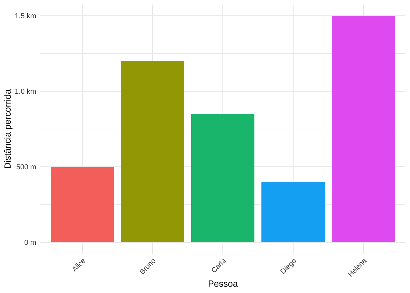
3.2.8 Divisão de legendas
library(ggnewscale)(basep <- ggplot(mpg, aes(displ, hwy)) +
geom_point(aes(colour = factor(year), shape = factor(cyl))))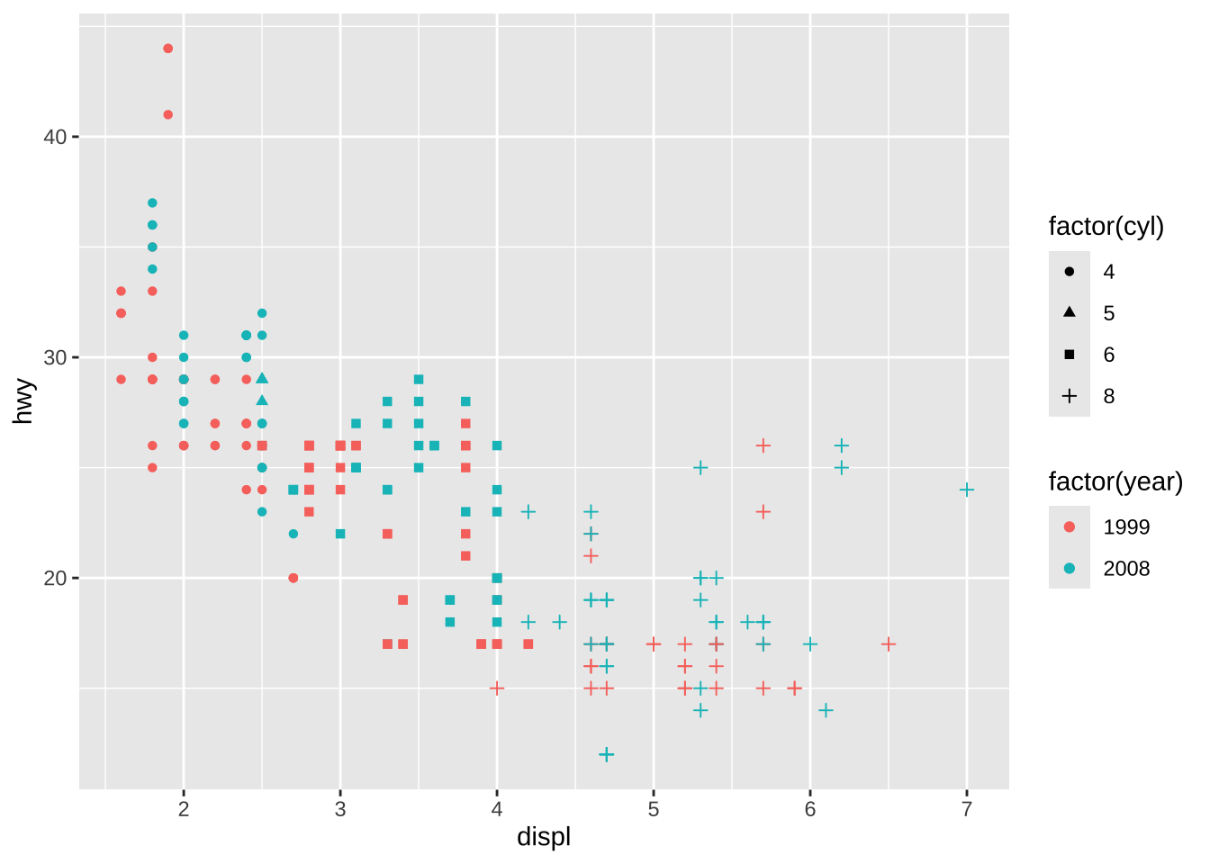
(base <- ggplot(mpg, aes(displ, hwy)) +
geom_point(aes(colour = factor(year)), size = 5)) 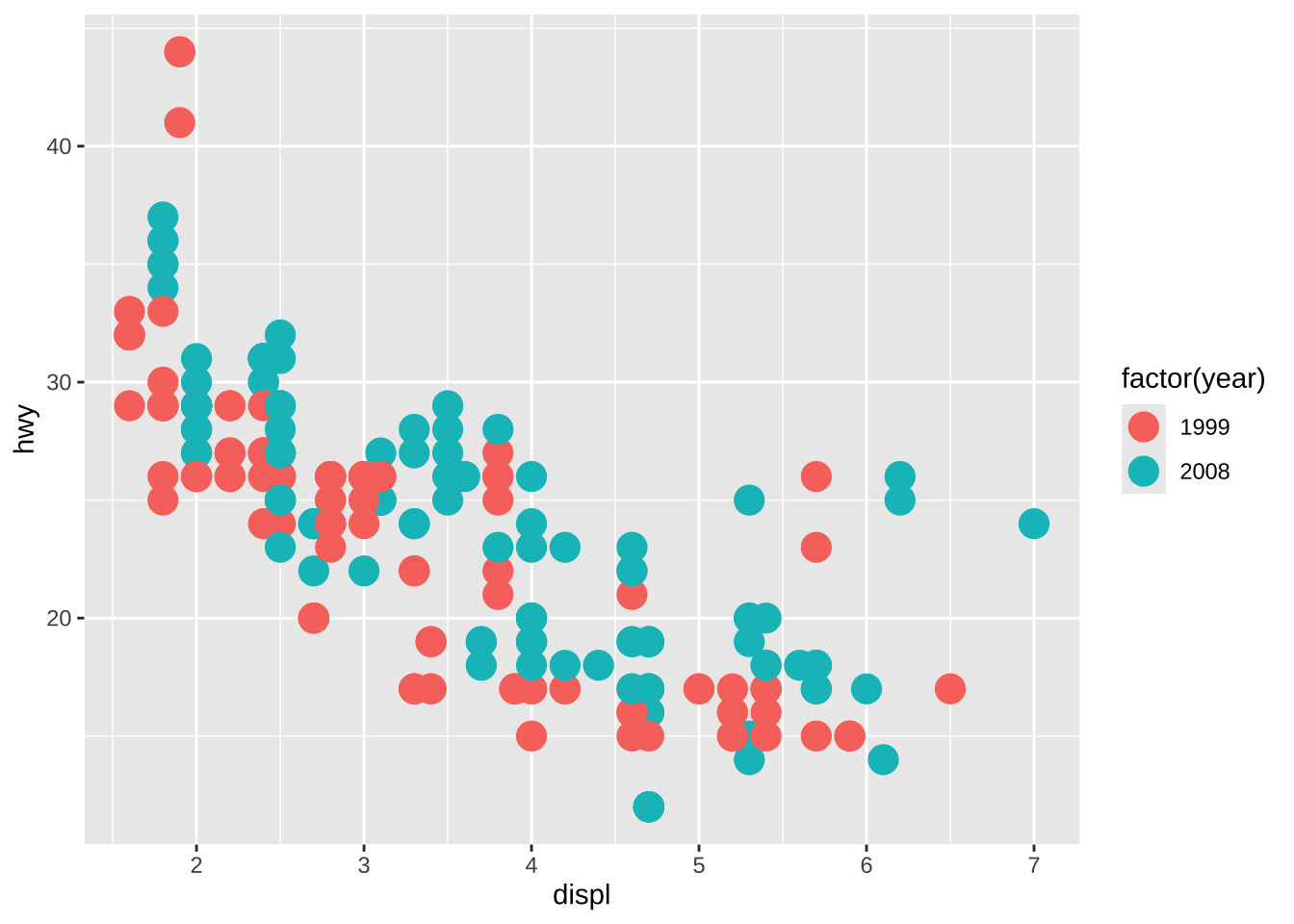
base +
  new_scale_colour() +
  geom_point(aes(colour = cyl == 4), size = 1) +
  scale_colour_manual("4 cylinder", values = c("blue", "black"))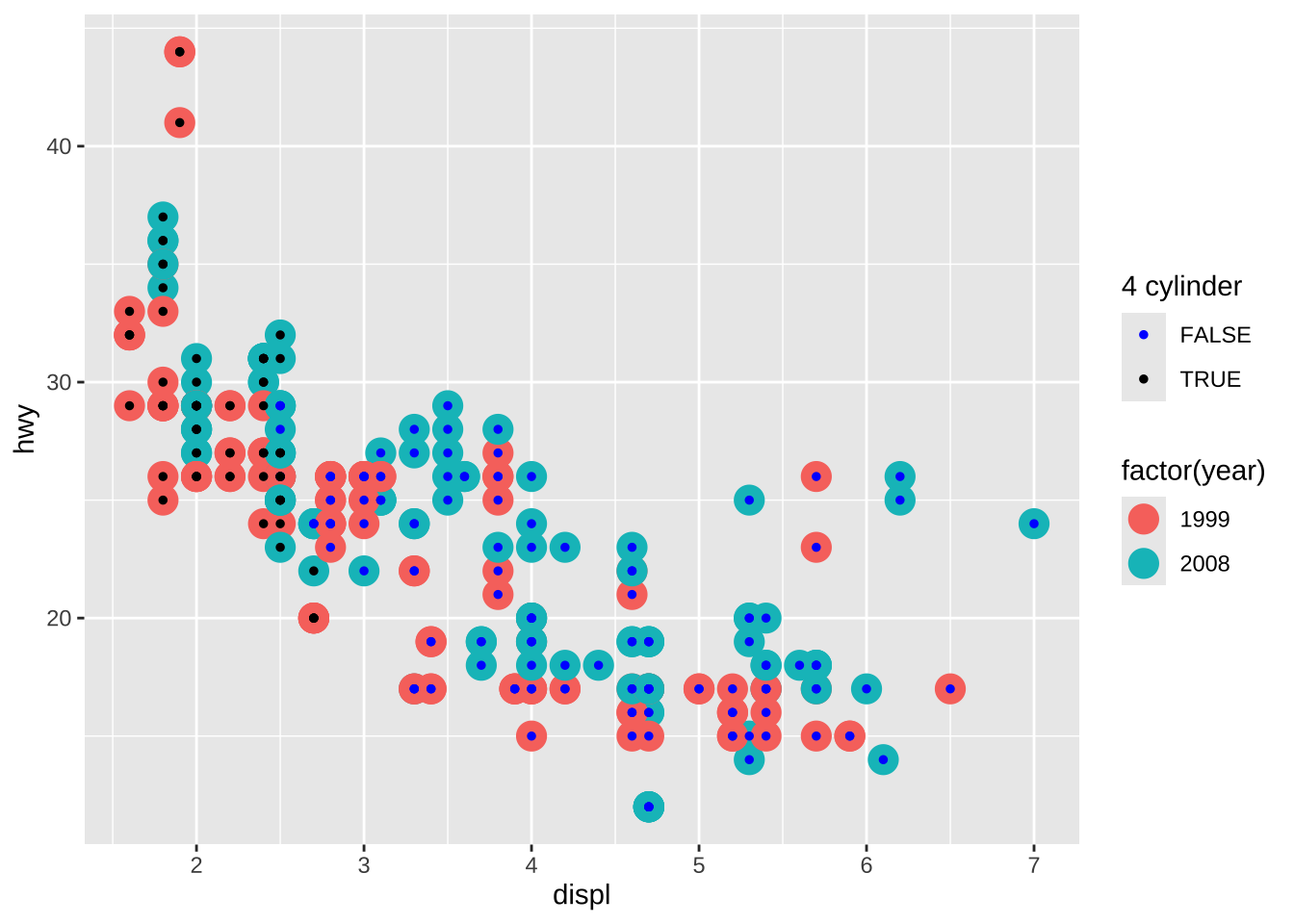
3.2.9 Personalização o background
pen <- na.omit(palmerpenguins::penguins)
pen$species <- factor(pen$species, levels = c("Chinstrap", "Gentoo", "Adelie"))

(p <- ggplot(pen, aes(x = species, y = body_mass_g, fill = species)) +
  geom_boxplot() +
  scale_fill_manual(values = c("#C35BCA", "#0D7475", "#FF6B07")) +
  labs(title = " ", x = "Espécie", y = "Massa corporal (g)") +
  theme_classic() +
  theme(plot.background = element_rect(fill = "#64D2AA"),
        panel.background = element_rect(fill = "yellow"),
        legend.background = element_rect(fill = "lightblue")))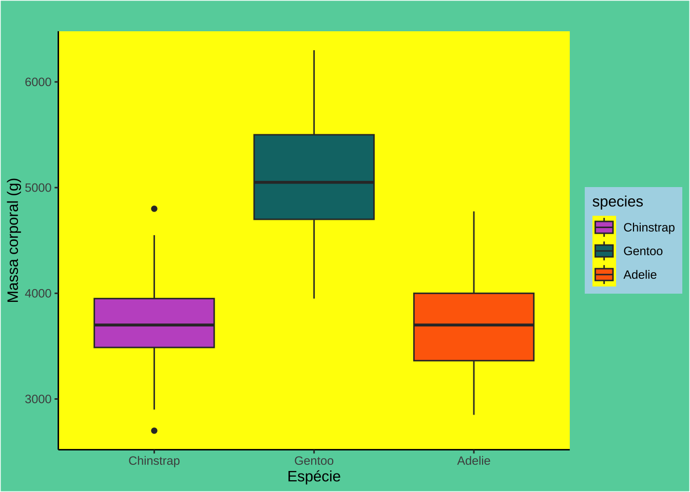
library(png)
fig <- readPNG("penguins.png")

(p <- ggplot(pen, aes(x = species, y = body_mass_g, fill = species)) +
  geom_boxplot() +
    scale_fill_manual(values = c("#C35BCA", "#0D7475", "#FF6B07")) +
  labs(title = " ", x = "Espécie", y = "Massa corporal (g)") +
  theme_minimal() +
  theme(legend.position = "none"))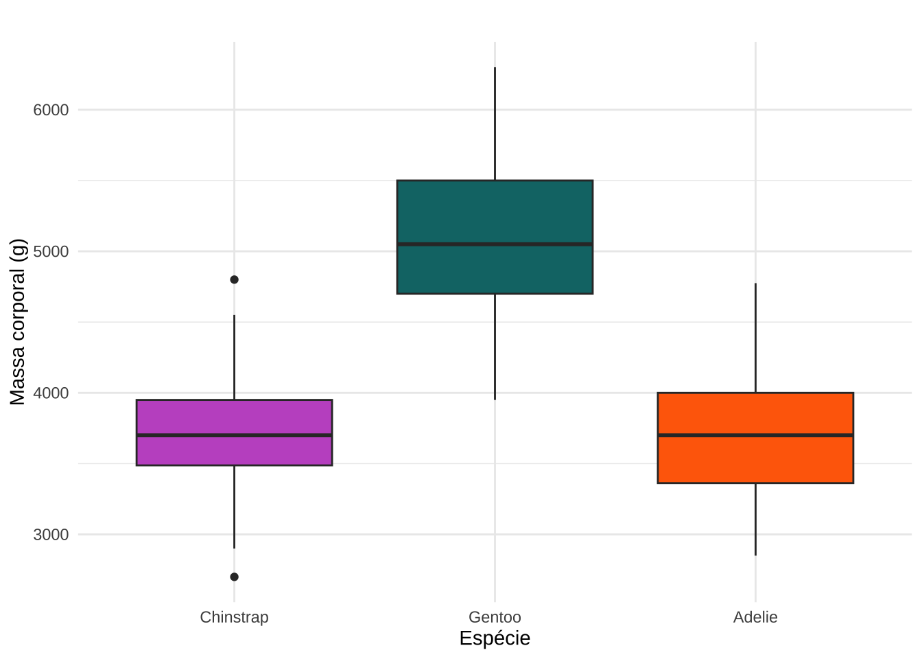
p +
  annotation_custom(
    grid::rasterGrob(fig, width = unit(5, "cm"), height = unit(2.5, "cm")),
    xmin = 2.4, xmax = 3.7,
    ymin = 5500, ymax = 6000)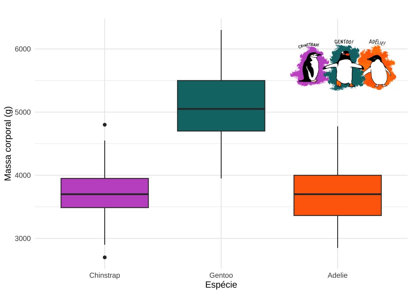
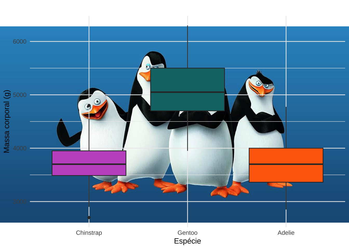
library(jpeg)
fig <- readJPEG("madagascar.jpg")

ggplot(pen, aes(x = species, y = body_mass_g, fill = species)) +
    annotation_custom(
    grid::rasterGrob(fig, width = unit(1, "npc"), height = unit(1, "npc"))) +
    geom_boxplot() +
    scale_fill_manual(values = c("#C35BCA", "#0D7475", "#FF6B07")) +
    labs(title = " ", x = "Espécie", y = "Massa corporal (g)") +
    theme_minimal() +
    theme(legend.position = "none")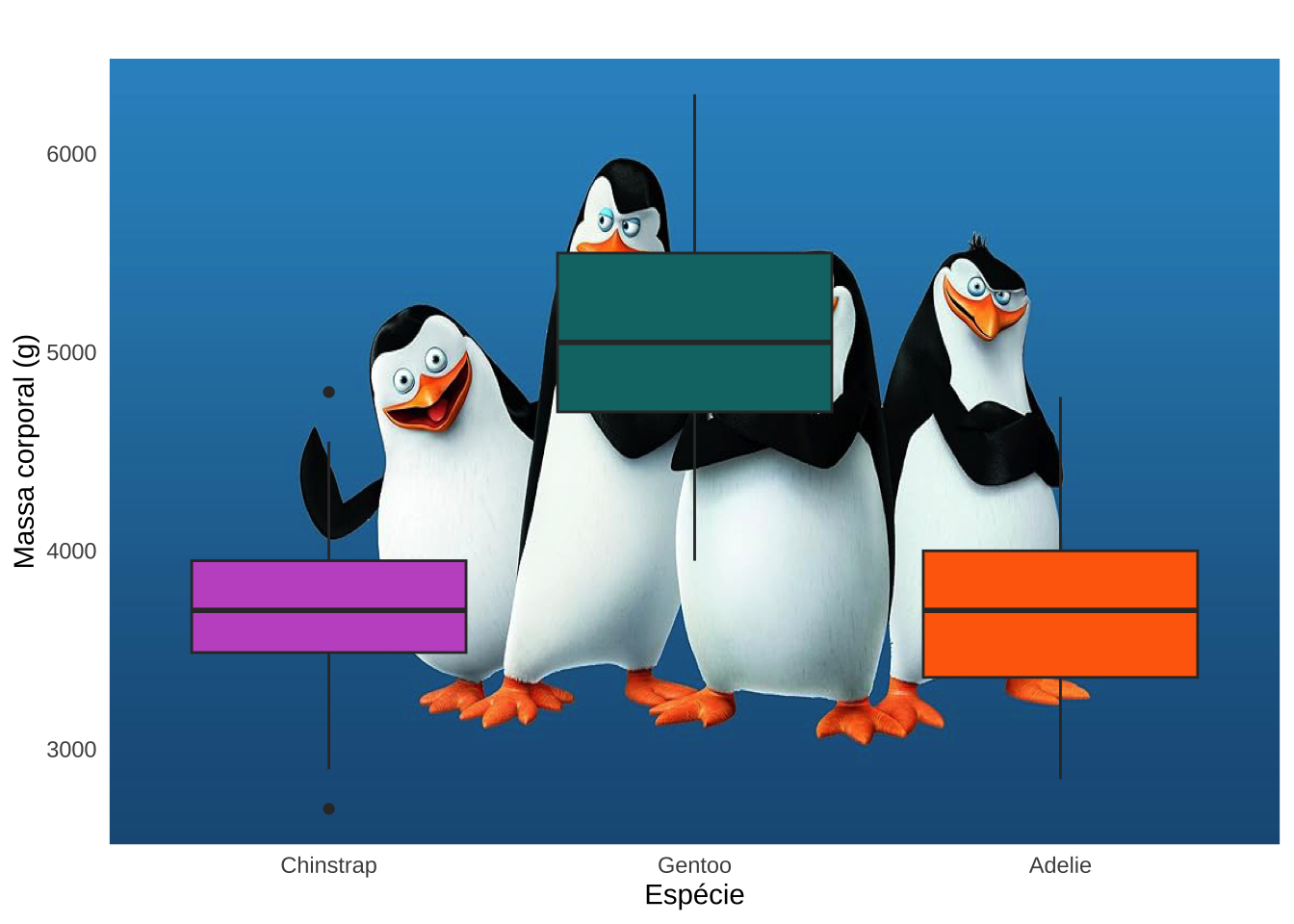
library(cowplot)
ggdraw() +
  draw_image("madagascar.jpg", scale = 1) +
  draw_plot(p)