Este livro foi lançado no curso STORYTELLING WITH DATA IN R promovido pelo RLadies Goiânia, onde a escritora Wanessa Alves Lima propôs o desafio a seguir.
Este conjunto de dados captura transações diárias de vendas de uma cafeteria na Cidade do Cabo (África do Sul). Ele foi projetado para ajudar a explorar os hábitos do cliente e o desempenho dos negócios.
money: Valor gasto por transação (em rands sul-africanos).
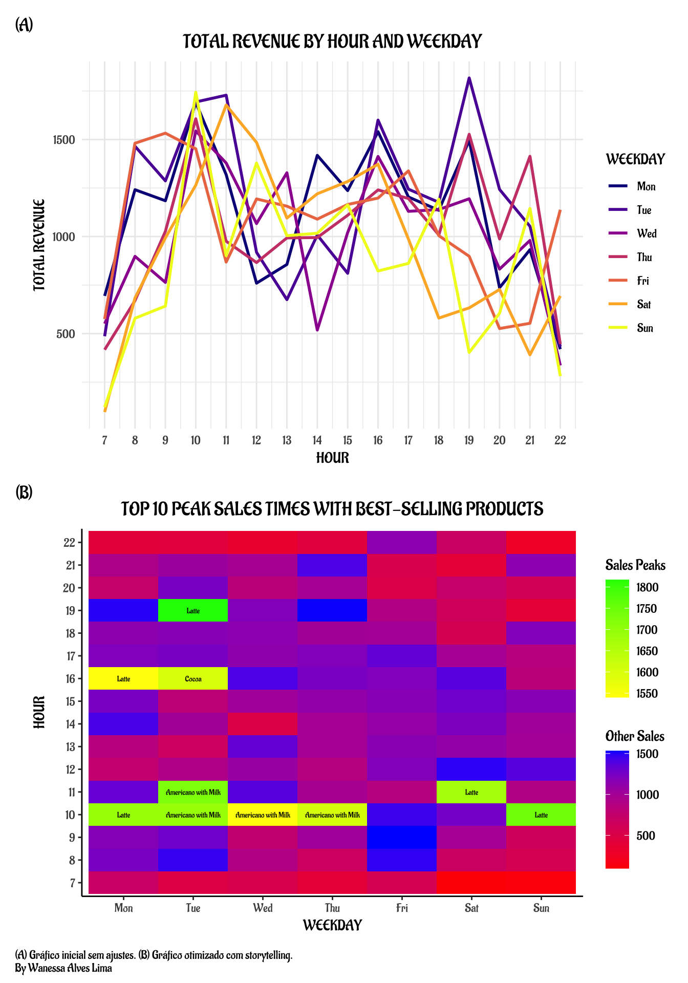
# Agregar receita total por hora e dia da semanadados_agg <- dados %>%group_by(hour_of_day, Weekday) %>%summarise(total_money =sum(money))# Definir fator ordenado para dias da semanadados_agg$Weekday <-factor(dados_agg$Weekday,levels =c("Mon", "Tue", "Wed", "Thu", "Fri", "Sat", "Sun"))# Gráfico de linha colorido pelo dia da semanag1 <-ggplot(dados_agg, aes(x = hour_of_day, y = total_money, color = Weekday)) +geom_line(size =1) +scale_color_viridis_d(option ="plasma") +scale_x_continuous(breaks =seq(min(dados_agg$hour_of_day),max(dados_agg$hour_of_day),by =1)) +labs(title ="TOTAL REVENUE BY HOUR AND WEEKDAY",x ="HOUR",y ="TOTAL REVENUE",color ="WEEKDAY") +theme_minimal(base_family ="Zilla") +theme(plot.title =element_text(hjust =0.5, size =14))
Depois
library(ggnewscale)# Agregação: soma total por hora e diatotal_por_hora_dia <- dados %>%group_by(hour_of_day, Weekday) %>%summarise(total_money =sum(money)) %>%ungroup()# Encontrar o café de maior receita para cada hora e diacoffee_top <- dados %>%group_by(hour_of_day, Weekday, coffee_name) %>%summarise(coffee_money =sum(money)) %>%ungroup() %>%group_by(hour_of_day, Weekday) %>%slice_max(coffee_money, n =1) %>%ungroup() %>%select(hour_of_day, Weekday, coffee_name)# Juntar o nome do café dominante à agregação totalheatmap_data <- total_por_hora_dia %>%left_join(coffee_top, by =c("hour_of_day", "Weekday"))# Definir fator dos dias da semanaheatmap_data$Weekday <-factor(heatmap_data$Weekday,levels =c("Mon", "Tue", "Wed", "Thu", "Fri", "Sat", "Sun"))# Identificar top 10 picosheatmap_data <- heatmap_data %>%mutate(is_top10 = total_money %in% (sort(total_money, decreasing =TRUE)[1:10]))# Criar subconjuntostop10 <-filter(heatmap_data, is_top10 ==TRUE)resto <-filter(heatmap_data, is_top10 ==FALSE)# Plot com escalas de cor separadas e labels para top 10g2 <-ggplot() +geom_tile(data = resto, aes(x = Weekday, y =factor(hour_of_day), fill = total_money)) +scale_fill_gradient(low ="red", high ="blue", name ="Other Sales") +new_scale_fill() +geom_tile(data = top10, aes(x = Weekday, y =factor(hour_of_day), fill = total_money)) +scale_fill_gradient(low ="yellow", high ="green", name ="Sales Peaks") +geom_text(data = top10,aes(x = Weekday, y =factor(hour_of_day), label = coffee_name),size =2, family ="Zilla", fontface ="bold", color ="black") +labs(title ="TOP 10 PEAK SALES TIMES WITH BEST-SELLING PRODUCTS",x ="WEEKDAY",y ="HOUR") +theme_classic(base_family ="Zilla") +theme(plot.title =element_text(hjust =0.5, size =14))
Grid dos gráficos
g1 / g2 +plot_annotation(caption ="(A) Gráfico inicial sem ajustes. (B) Gráfico otimizado com storytelling. \nBy Wanessa Alves Lima",tag_levels ="A", tag_prefix ="(", tag_suffix =")",theme =theme(plot.caption =element_text(hjust =0, family ="Zilla") ) )
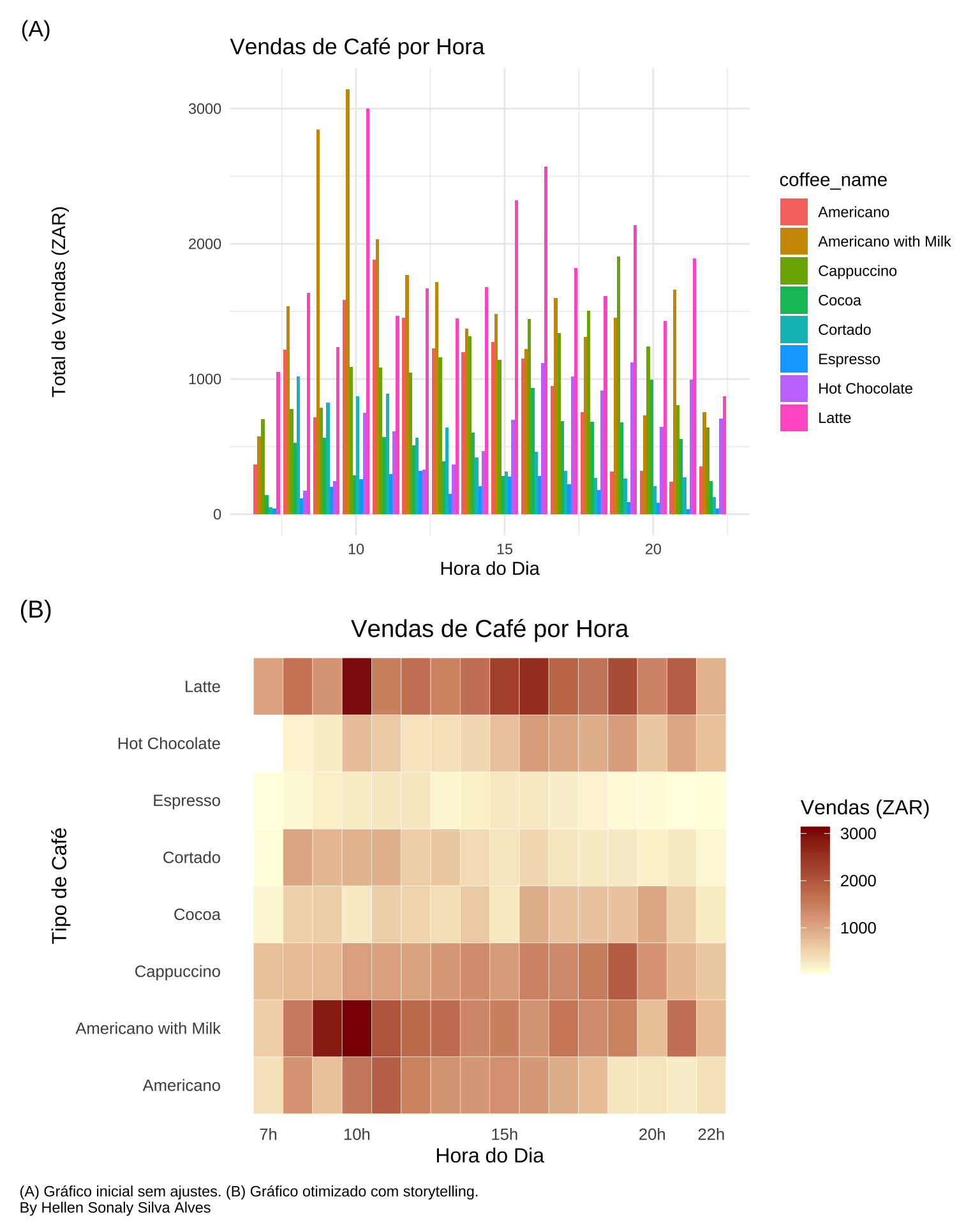
8.2.2 Hellen Sonaly Silva Alves
Antes
df_hour <- dados %>%group_by(hour_of_day, coffee_name) %>%summarise(total_sales =sum(money), .groups ='drop')g1 <-ggplot(df_hour, aes(x = hour_of_day, y = total_sales, fill = coffee_name)) +geom_bar(stat ="identity", position ="dodge") +labs(title ="Vendas de Café por Hora",x ="Hora do Dia", y ="Total de Vendas (ZAR)") +theme_minimal()
Depois
g2 <-ggplot(df_hour, aes(x = hour_of_day, y = coffee_name, fill = total_sales)) +geom_tile(color ="white") +scale_fill_gradient(low ="lightyellow", high ="darkred") +scale_x_continuous(breaks =c(7, 22, 10, 15, 20),labels =function(x) paste0(x, "h")) +labs(title ="Vendas de Café por Hora",x ="Hora do Dia", y ="Tipo de Café", fill ="Vendas (ZAR)") +theme_minimal(base_size =12) +theme(plot.title =element_text(hjust =0.5),panel.grid =element_blank())
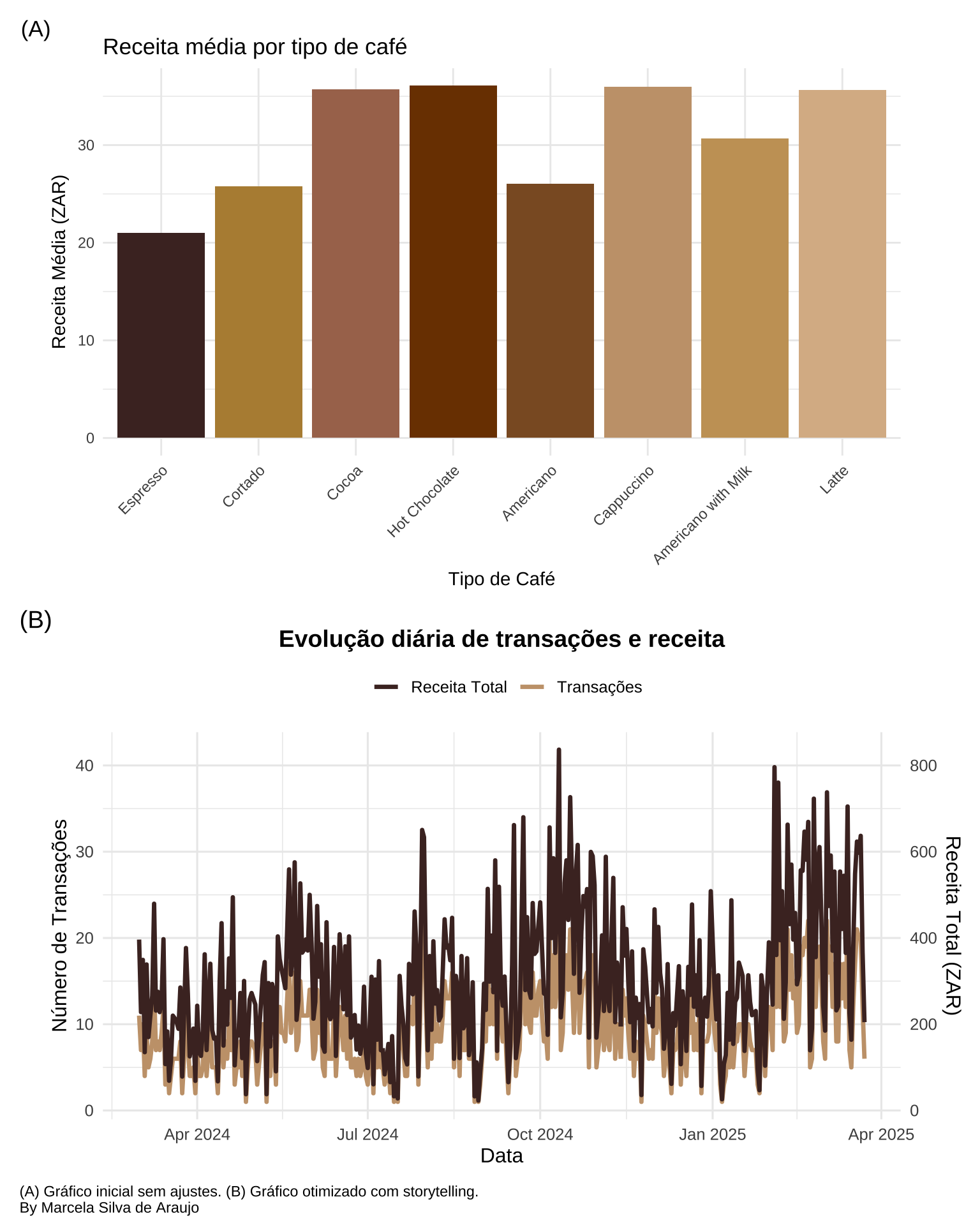
# Distribuição da receita por tipo de cafédados_receita <- dados %>%group_by(coffee_name) %>%summarise(receita_media =mean(money),receita_total =sum(money),transacoes =n(),.groups ='drop' ) %>%mutate(coffee_name =fct_reorder(coffee_name, receita_total))# Média de transações e receita diáriadados_diario <- dados %>%group_by(datetime =as.Date(datetime)) %>%summarise(transacoes =n(),receita_total =sum(money),receita_media =mean(money),.groups ='drop' )# Paleta temática Café cores_cafe <-c("Espresso"="#4B2E2B","Cappuccino"="#C7A17A","Latte"="#DAB894","Hot Chocolate"="#7B3F00","Americano"="#8B5A2B","Cocoa"="#A9745B","Cortado"="#B68D40","Americano with Milk"="#C8A165")
Antes
g1 <-ggplot(dados_receita, aes(x = coffee_name, y = receita_media, fill = coffee_name)) +geom_col() +scale_fill_manual(values = cores_cafe) +labs(title ="Receita média por tipo de café",x ="Tipo de Café",y ="Receita Média (ZAR)" ) +theme_minimal() +theme(axis.text.x =element_text(angle =45, hjust =1),legend.position ="none" )
Depois
g2 <-ggplot(dados_diario, aes(x = datetime)) +geom_line(aes(y = transacoes, color ="Transações"), linewidth =1.2) +geom_line(aes(y = receita_total/20, color ="Receita Total"), size =1.2) +scale_y_continuous(name ="Número de Transações",sec.axis =sec_axis(~.*20, name ="Receita Total (ZAR)") ) +scale_color_manual(values =c("Transações"="#C7A17A", "Receita Total"="#4B2E2B" )) +labs(title ="Evolução diária de transações e receita",x ="Data",color ="" ) +theme_minimal(base_size =12) +theme(plot.title =element_text(hjust =0.5, face ="bold", size =14),legend.position ="top" )
Grid dos gráficos
g1 / g2 +plot_annotation(caption ="(A) Gráfico inicial sem ajustes. (B) Gráfico otimizado com storytelling. \nBy Marcela Silva de Araujo",tag_levels ="A",tag_prefix ="(",tag_suffix =")",theme =theme(plot.caption =element_text(hjust =0)))